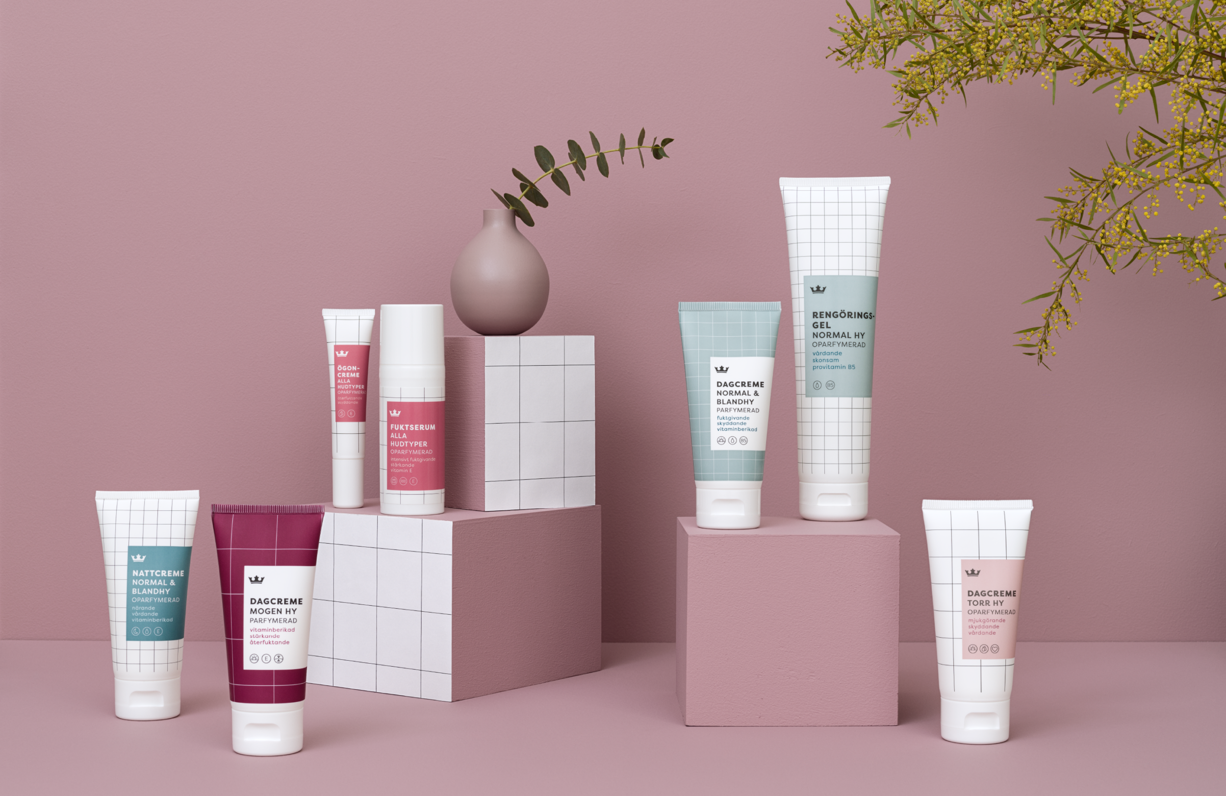
Kronans Apotek is one of the largest pharmacy chains in Sweden. Their private label range consist of caring products at good value with a professional and pharmaceutical expertise, counting more than 90 products in different categories.
The challenge from Kronan was to make the product range more attractive and coherent while strenghtening the Kronan brand perception. There was a need for a design solution with a strong identity and a consistent system that could easily adapt to different categories. As a first step we redesigned around 30 products, in four categories (hair, face, body and extra care).
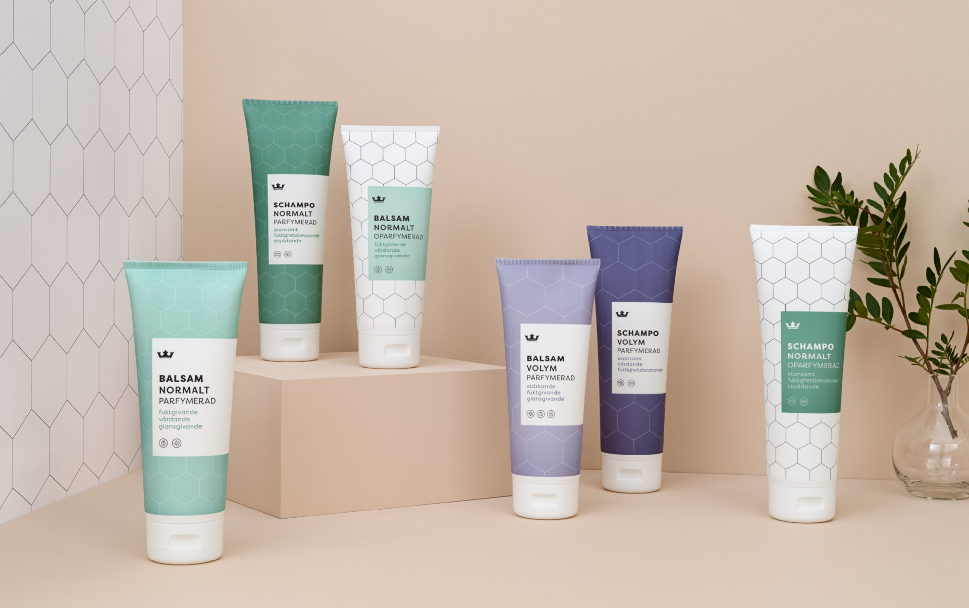
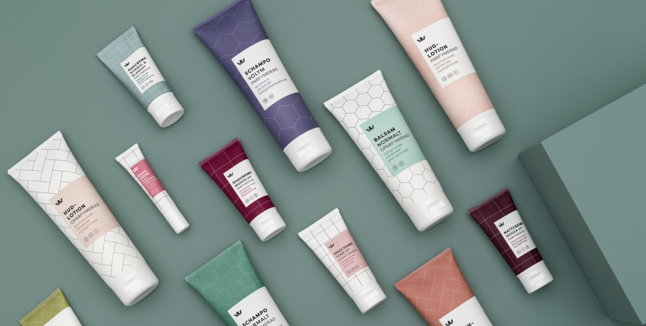
To find a unique expression we went back to where it all happens. The products own habitat – the bathroom. Our design system is based on different patterns inspired by bathroom tiles and mosaics. The patterns vary in shape and colour to accomodate an easy and dynamic navigation system. The result? A professional and modern take on a private label, with a unique expression that you wish to expose on your bathroom shelf. Private, natural and simple.
Kronans Apotek is one of the largest pharmacy chains in Sweden. Their private label range consist of caring products at good value with a professional and pharmaceutical expertise, counting more than 90 products in different categories.
The challenge from Kronan was to make the product...
Clean and geometrical, the patterns are directly inspired by bathroom mosaics and used as base for the design system. They can vary in shape to differentiate each category (face, body, hair…). Inside a category, colour and size can change to fit a product’s characteristics. For instance, pattern on a white background means the product is non perfumed and pattern on coloured background is perfumed.

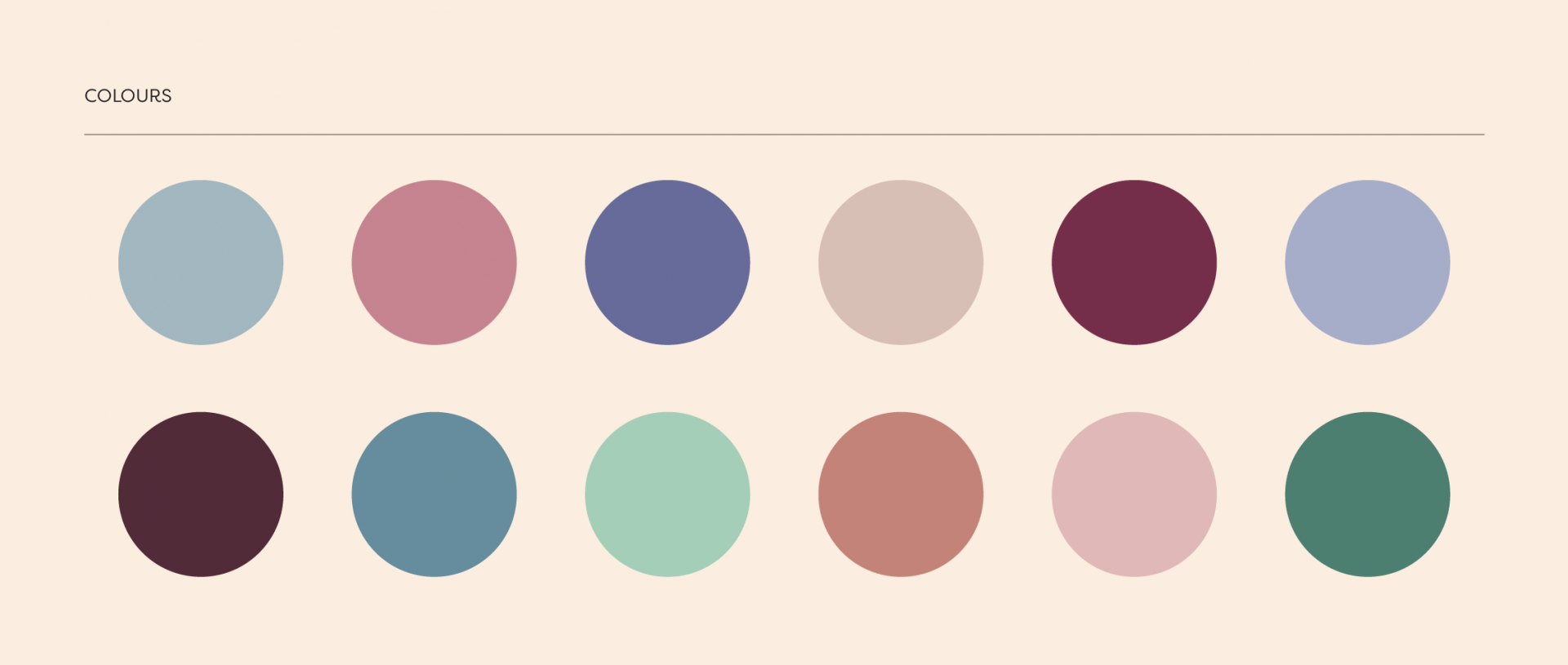
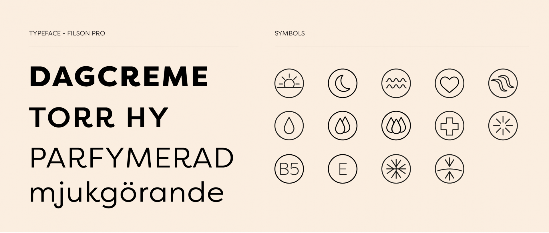
Other graphic elements contribute to give the design a fresh, cosmetic and professional character; A feminine and modern colour palette that softly highlights the tile patterns, a geometric but elegant typeface, and symbols to visually communicate the products characteristics.
Emelie Friis
Head of marketing, Kronans Apotek
