Universal Design Studio
KSV Jewellery
Holmquistsign
Scannerlicker Foundry
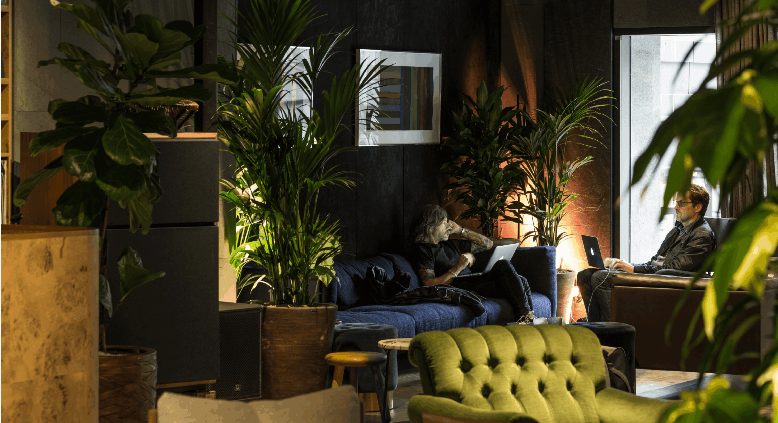
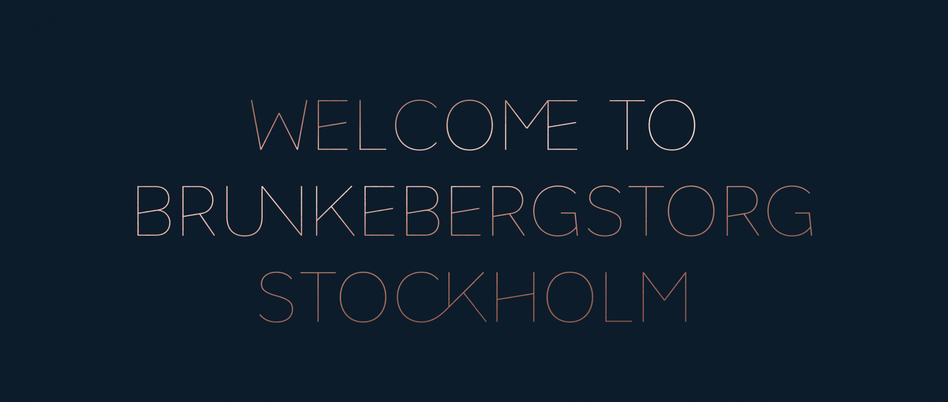
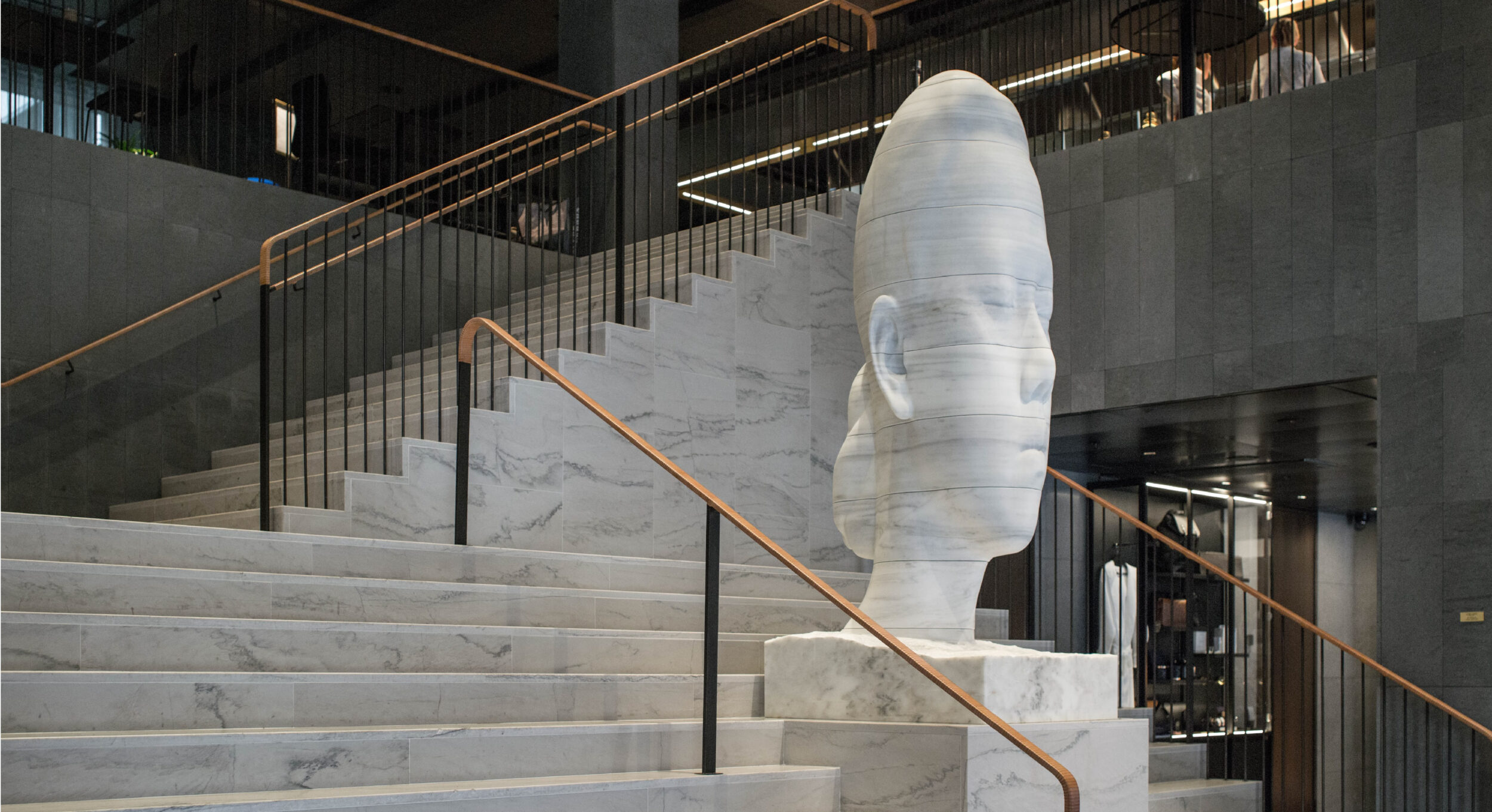
Nordic Choice Hotels acquired a listed, former bank headquarter on the city square of Brunkebergstorg, number 6. Previously a 19th-century haven for socialites, but neglected in the recent years. The plan was to take this privileged location and create state-of-the-art 5 star luxury hotel that would give life back to the square and the brutalist building. 343 rooms of pure contemporary Nordic style, high-end quality art interiors, restaurants, bars, gym, event space that quickly became the buzz of the town.
With over 150 hotels within 72 square miles, Stockholm had no shortage of options for travellers. However only a few of those are luxury hotels and even fewer share its contemporary approach. Our job was to create its personality, name, expression and identity to help set it apart in a way that would feel authentic and at home with the brutalist building.
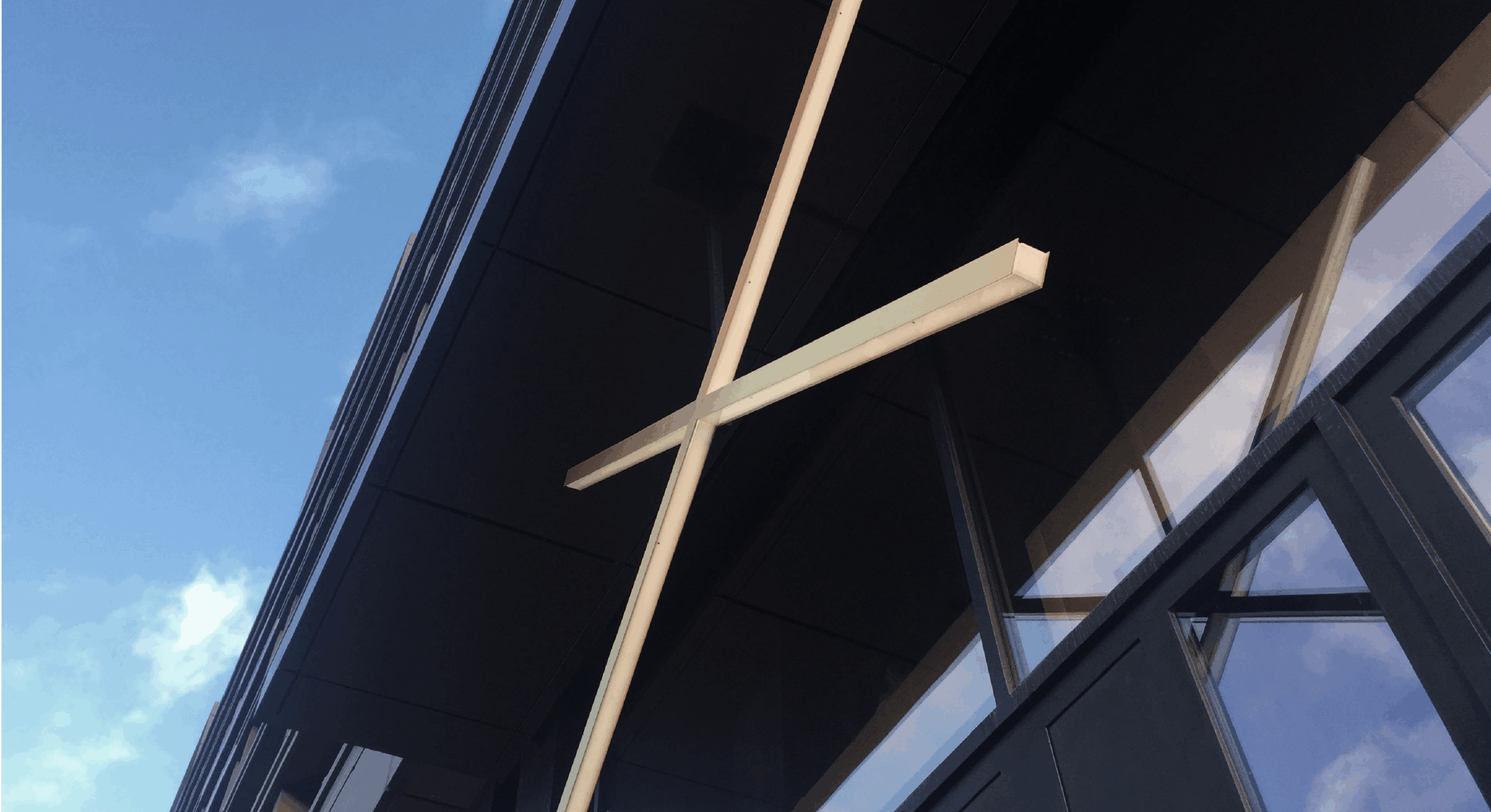
In a place where luxury, comfort and great service come standard, our approach was to develop a brand that came across as confident and as unpretentious as possible. The name, At Six, referring to its location, and the fine-line-expression, as a contrast with the brutalist architecture was our design idea. Light and elegant, as if invisible but always present, not getting in the way of what really matters, the experience. An approach that challenges the status quo of luxury hotels in Stockholm and goes hand in hand with Europe’s most ambitious contemporary art hotel.
Nordic Choice Hotels acquired a listed, former bank headquarter on the city square of Brunkebergstorg, number 6. Previously a 19th-century haven for socialites, but neglected in the recent years. The plan was to take this privileged location and create state-of-the-art 5 star luxury hotel that...
The fine lines and the odd construction contrast with the heavy and stiff brutalist architecture.
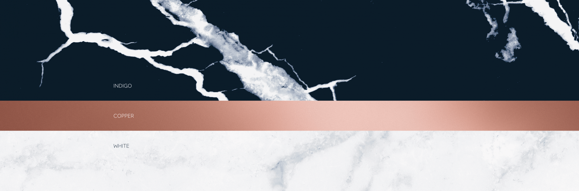
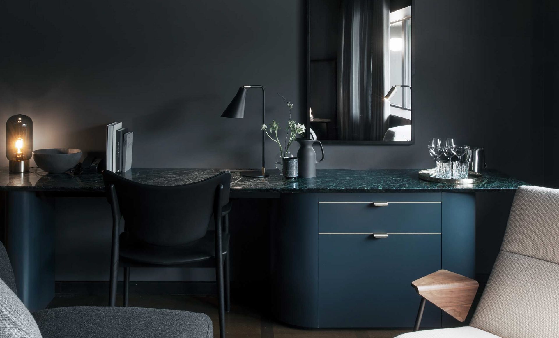
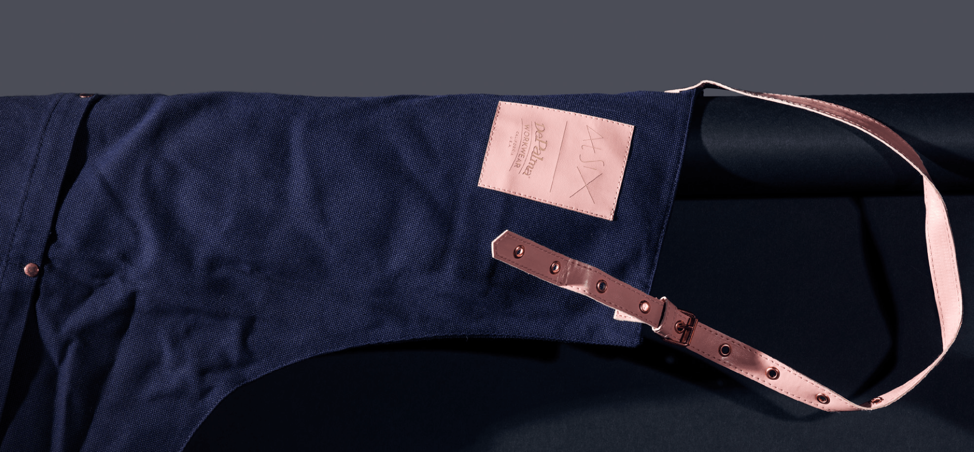
The choice of colours reflect a synergy between the identity and the interior design.
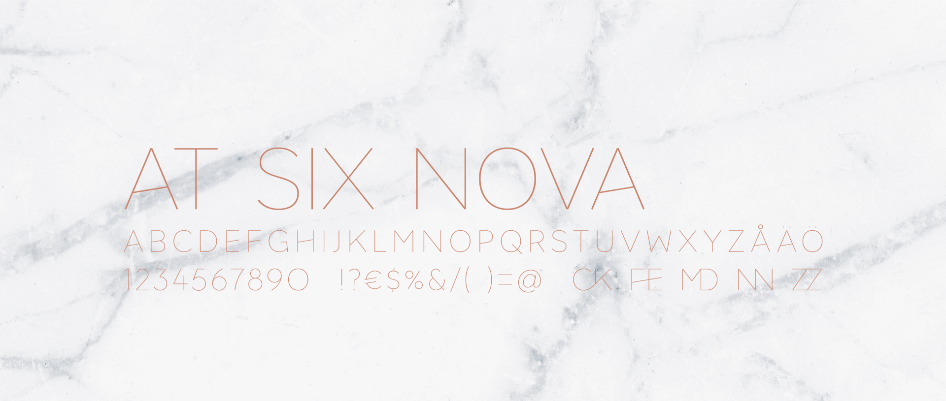
A custom typeface was developed to make sure the brand would be present even when a logo was not around.
The brand is felt throughout the spaces, big and small, even without the logo presence
The X symbol is used across the applications as a red thread without being intrusive.
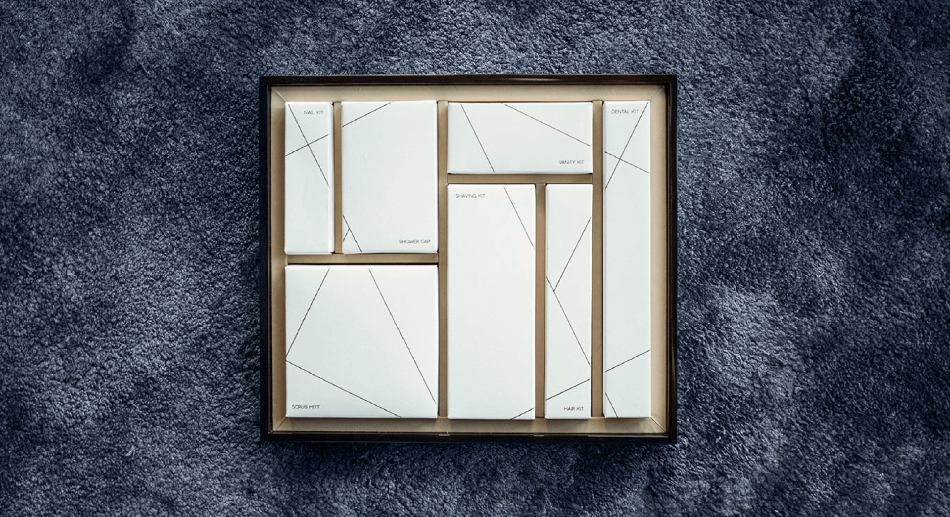
Collaborations where made with some of the best Swedish crafters in order to achieve an elegant assortment.
Jennie Hahmann Håkansson, CEO of At Six
*Winner of the AHEAD Awards, the International Hotel and Property Awards among other international recognitions.