So-type
Cancerfonden needs to be creative in the fight against cancer and always look at challenges from new perspectives. Sometimes they need to get close sometimes they need to take a step back to see the bigger perspective. They can never stand still and they need to turn every stone in their constant search for knowledge, support and engagement. Cancerfondens old identity and logotype did not reflect this and did also not live up to the requirements that is needed for digital channels. With the new logotype and identity Cancerfonden can reach out to everyone single one of us with the urgent message that we all need to help to defeat cancer.
Cancerfonden needs to be creative in the fight against cancer and always look at challenges from new perspectives. Sometimes they need to get close sometimes they need to take a step back to see the bigger perspective. They can never stand still and they need to turn every stone in their...
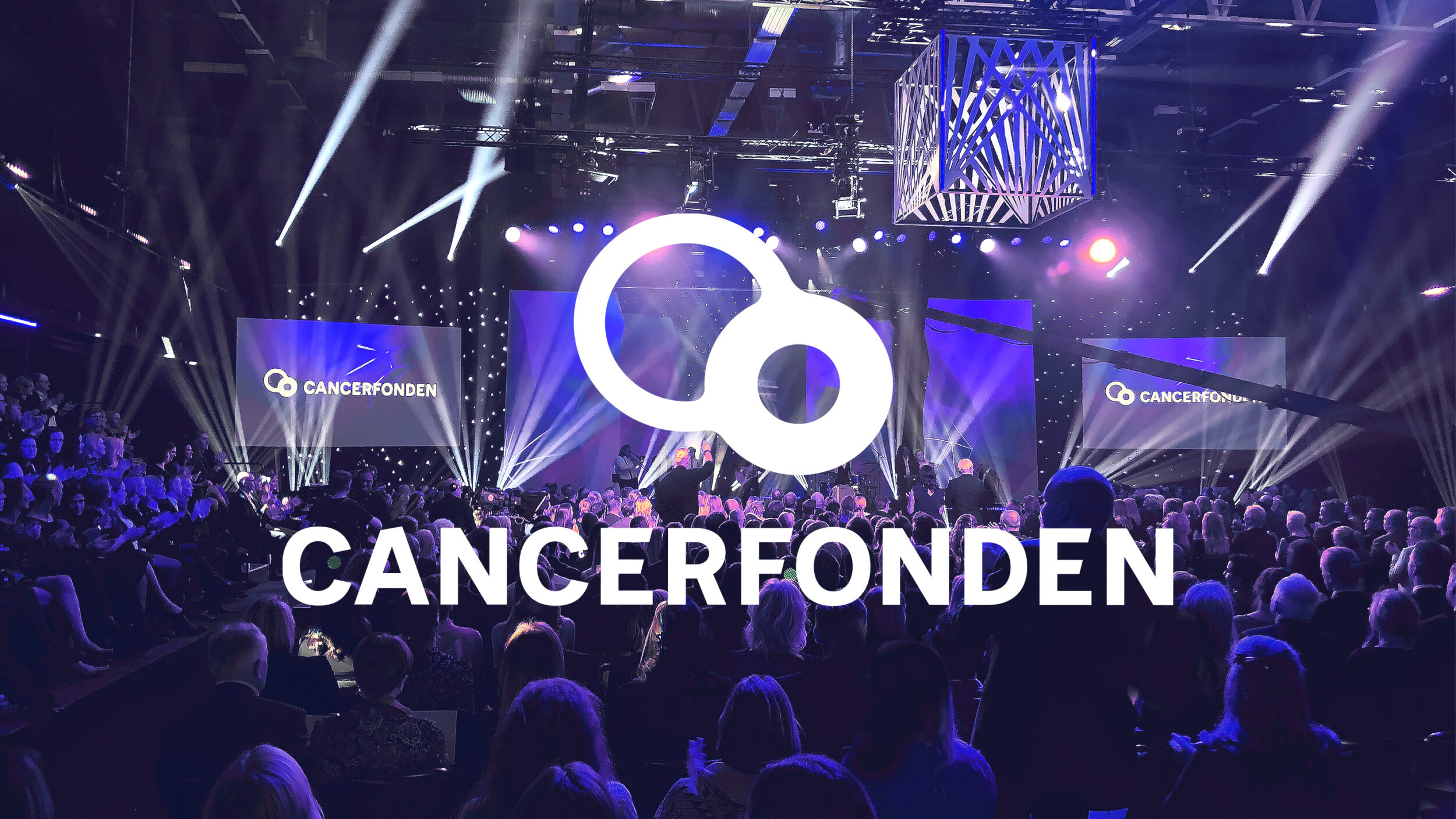
Cancerfonden is always moving, relentlessly looking for answers, seeing challenges and problems from new angles, twisting and turning every stone for new knowledge, committed to a common quest ”Together we will beat cancer”. This is represented in the new logotype and symbol.
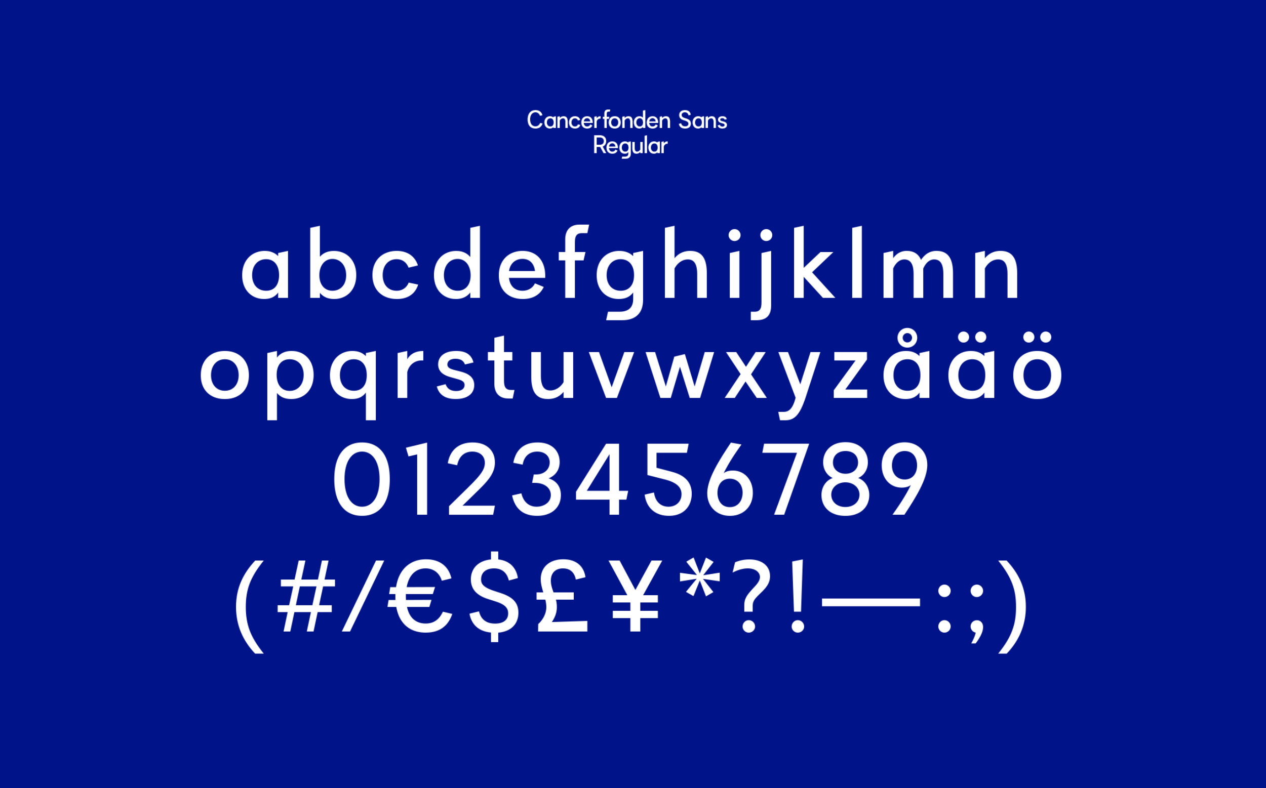
We developed a sans-serif with a clear character of new angles. It is specially adjusted to be legible in small sizes, facts and figures and have digital platforms in mind. But it also has enough personality to work on displays and headlines.
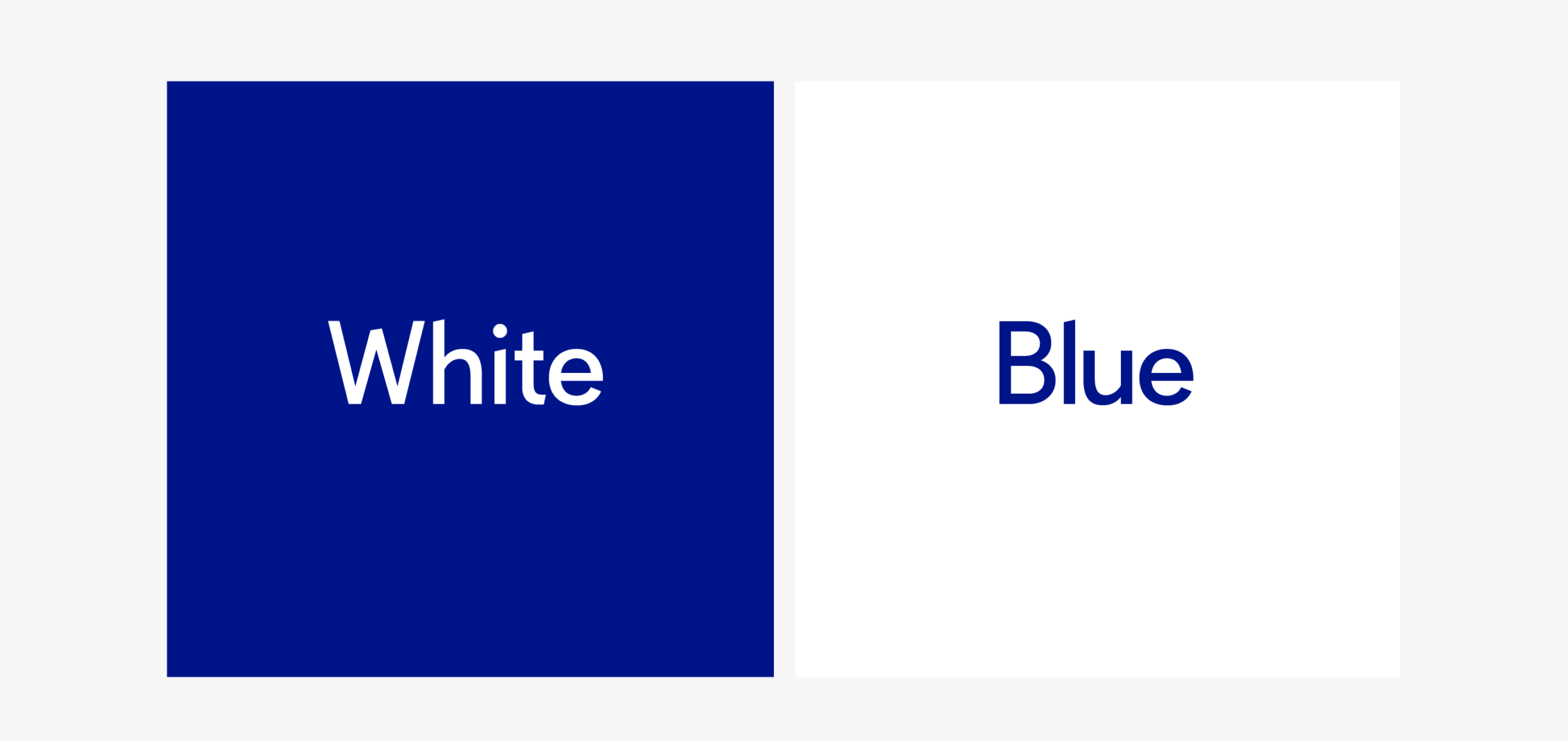
The Cancerfonden primary colours is Blue and White. These two colours is the foundation of the Cancerfonden brand and is the only colours used in the logotype.
The shapes are inspired by the symbol in the Cancerfonden logotype. It contains out of two circles — one in focus and one out of focus. These circles are in constant motion, change perspective and depth of field.
The shapes from the illustrations also works as a format to highlight details or persons in photography and video.
These illustrations are also inspired by the symbol and use a combination of thick and thin lines. This connects them to the logotype to help and strengthen Cancerfonden as a brand even when the logotype is not present.
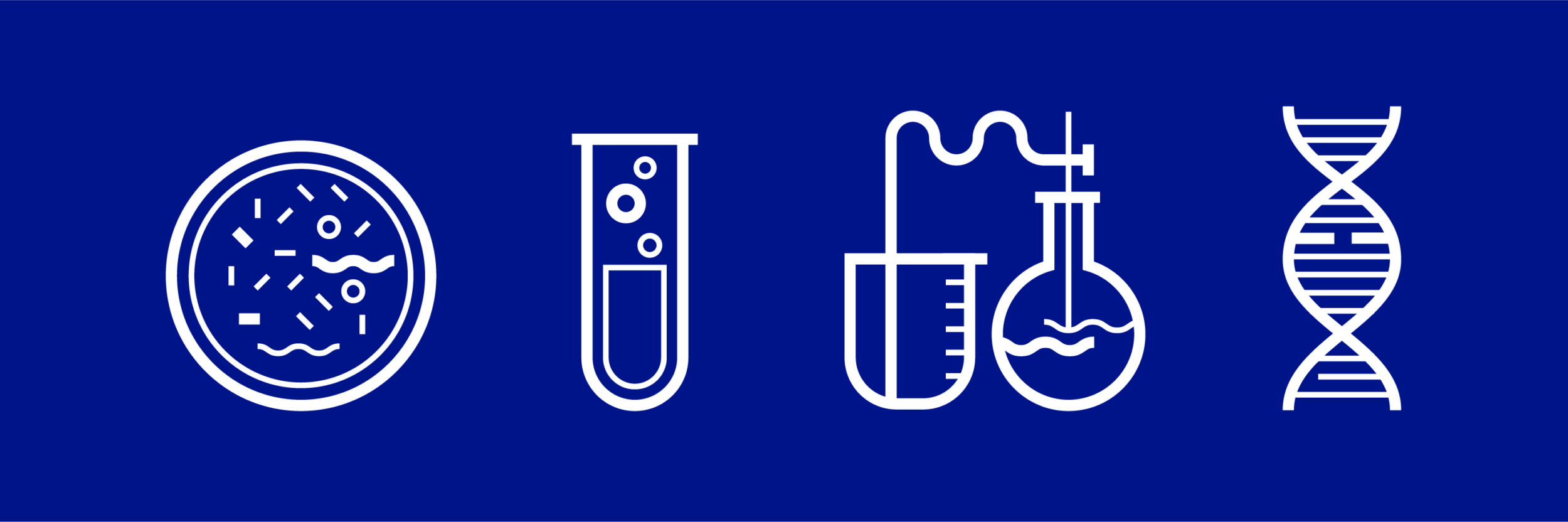
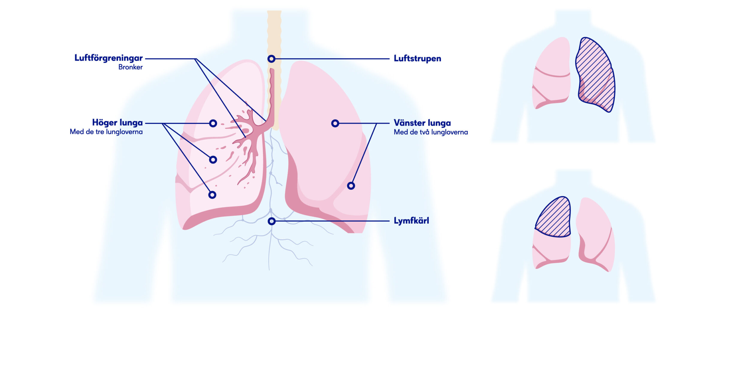
These illustrations are for more detailed and fact based motives, when communicative illustrations or photographs isn’t enough. Here we use the same principles in as in the abstract — focusing on the organs and letting the body be out of focus.
Veronica Espmark
Brand Manager, Cancerfonden
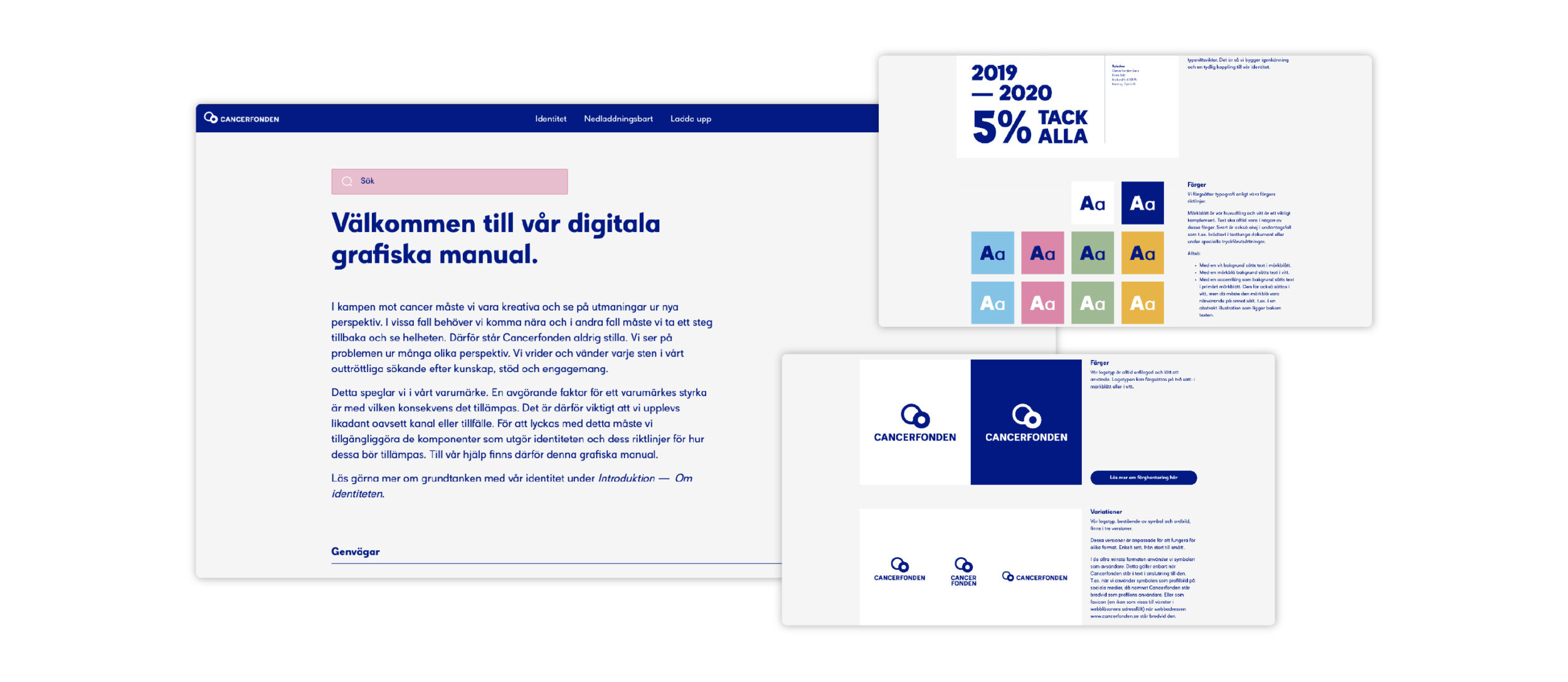
Cancerfondens digital guidelines makes it possibe for them to keep the identity and its guidelines constantly updated. It also gives them access to all downloadable files, such as logotypes, typography and illustrations.