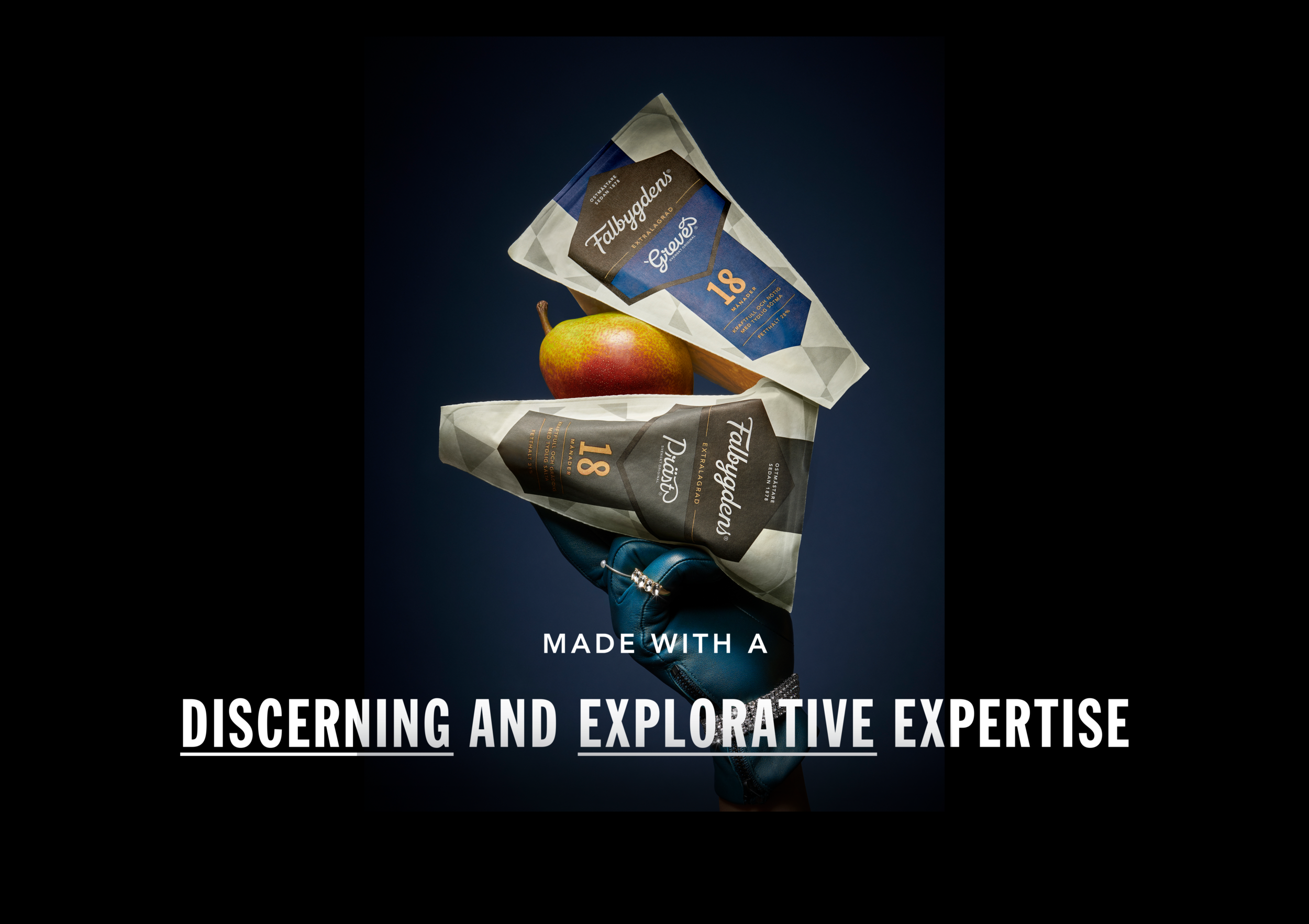
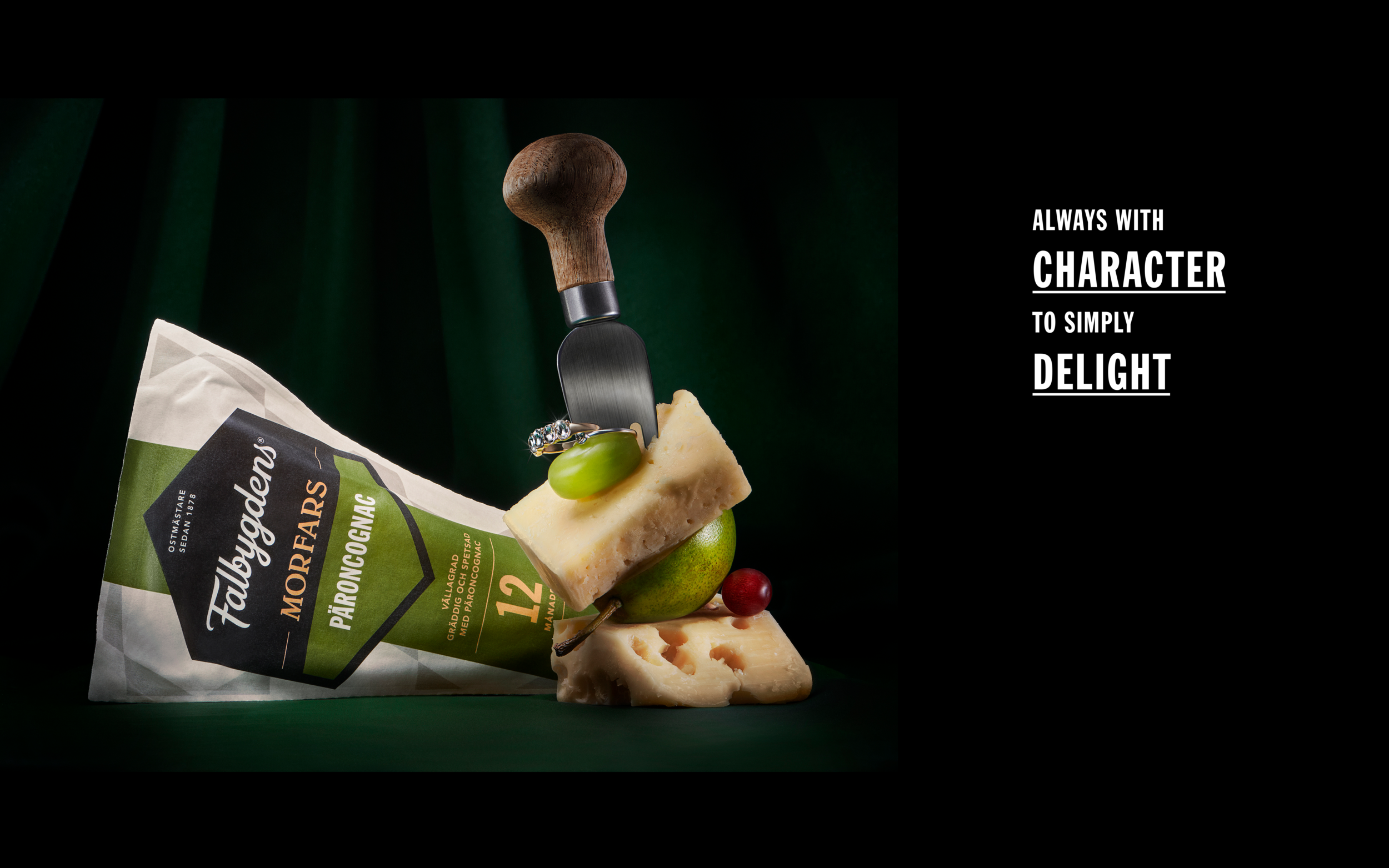
Falbygdens is a proud brand known for its quality and wide cheese assortment. But over the years the brand had become lost in the fragmentet design system and hierarchical complexity of the portfolio, resulting in the various cheese brands overshadowing the master brand.
The goal was to transition Falbygdens from an anonymous guarantor to reestablishing Falbygdens as a proud master brand — a distinctive cheese master whose selective expertise consistently delivers the highest possible cheese sensation, no matter the occasion.
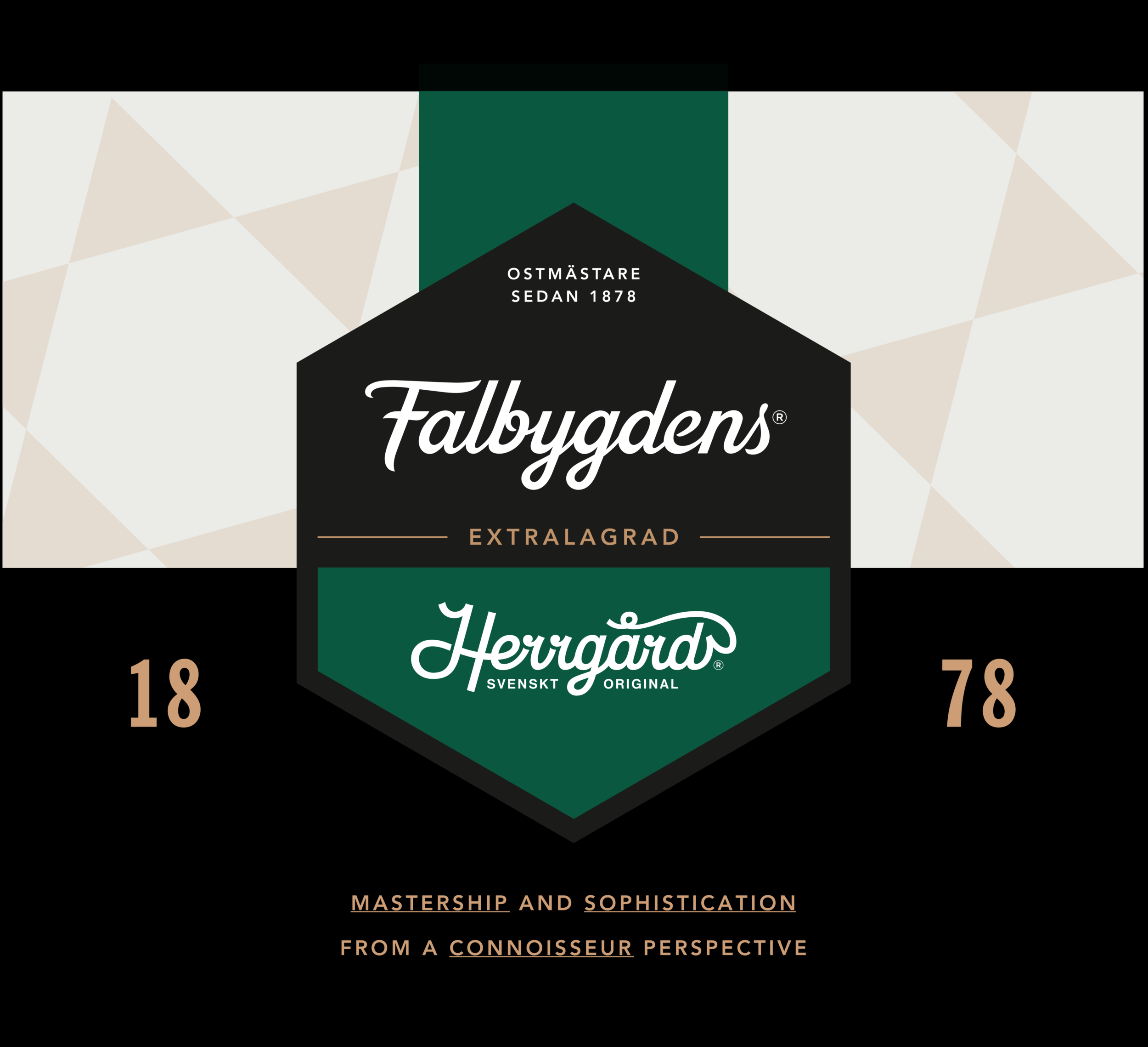
Inspired by the classic form of triangular cheese shapes, a distinctive pattern emerged to illustrate the diversity within Falbygdens selections. Each triangle represents a cheese variant that, when combined, forms Falbygdens iconic and identity-defining hexagon.
The hexagon serves as a proud and recognisable element in Falbygdens enhanced logotype. It also plays a central role in the stylistic structure of the design system, emphasising its refined and superior tone of voice.
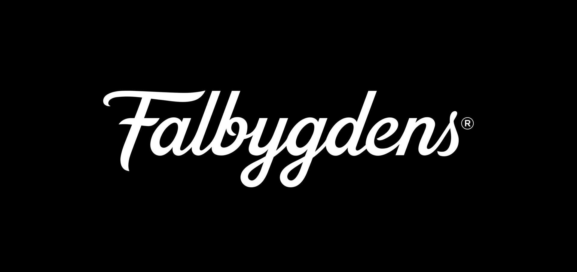
The logotype has gained a straightened spine, conveying a stronger sense of savouring finesse and quality. This marks a significant revolution, transforming Falbygdens from a local cheese collector to a bold and classy cheese connoisseur, with character to delight.
Thanks you Falbygdens for a brilliant collaboration!
Falbygdens is a proud brand known for its quality and wide cheese assortment. But over the years the brand had become lost in the fragmentet design system and hierarchical complexity of the portfolio, resulting in the various cheese brands overshadowing the master brand.
The goal...

