FAR is the institute for Swedish accountancy and holds a mission to serve its industry to do good for both the companies it represents and society. With the growth of digital media, FAR has found it increasingly necessary to develop its offering and, as a consequence, its visual identity with a prioritised challenge to develop the brand’s presence within digital channels.
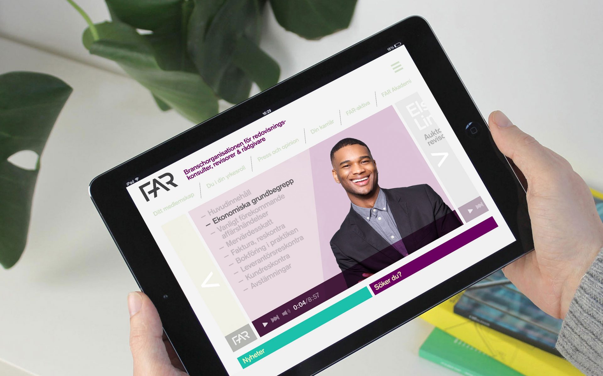
The strategic foundation resulted in a clarified masterbrand strategy. The objective through design was to then create a coherent brand experience – with a large room of flexibility for different channels and services. The design work resulted in a revised logotype, broadened colour palette and design system capable of providing a high degree of flexibility alongside a graphical format suitable for all channels. Additional focus was placed on digital, social, and motion media during implementation to better support FARs needs going forward.
Roll-out of the new brand strategy and visual identity has enabled FAR to act in accordance to their need – Flexible yet cohesive!
FAR is the institute for Swedish accountancy and holds a mission to serve its industry to do good for both the companies it represents and society. With the growth of digital media, FAR has found it increasingly necessary to develop its offering and, as a consequence, its...
The logotype was developed to give a more balanced impression. Letters were adjusted to correlate with each other whilst the lines were thickened to better work for digital formats.
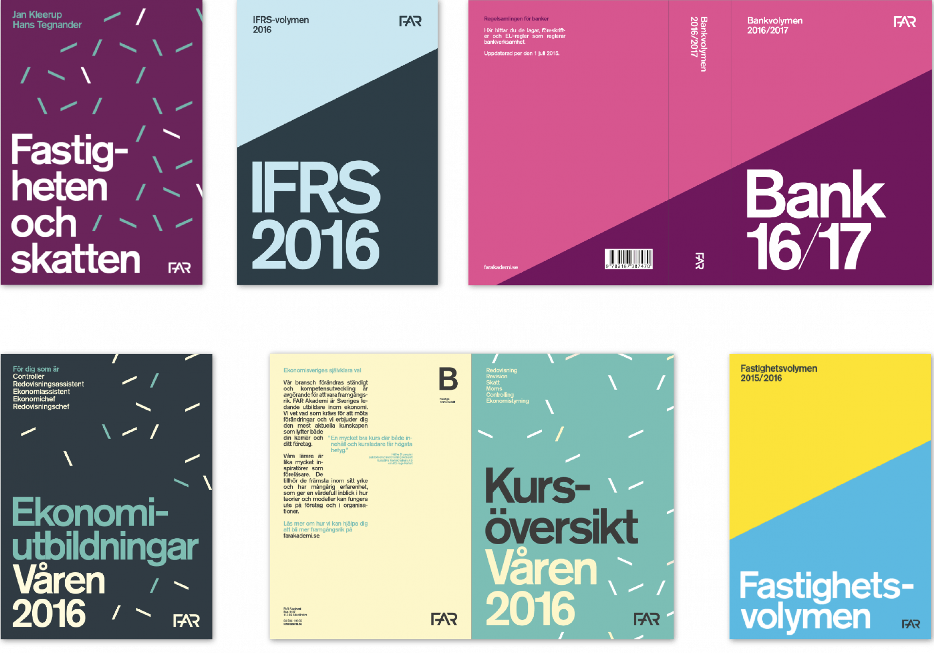
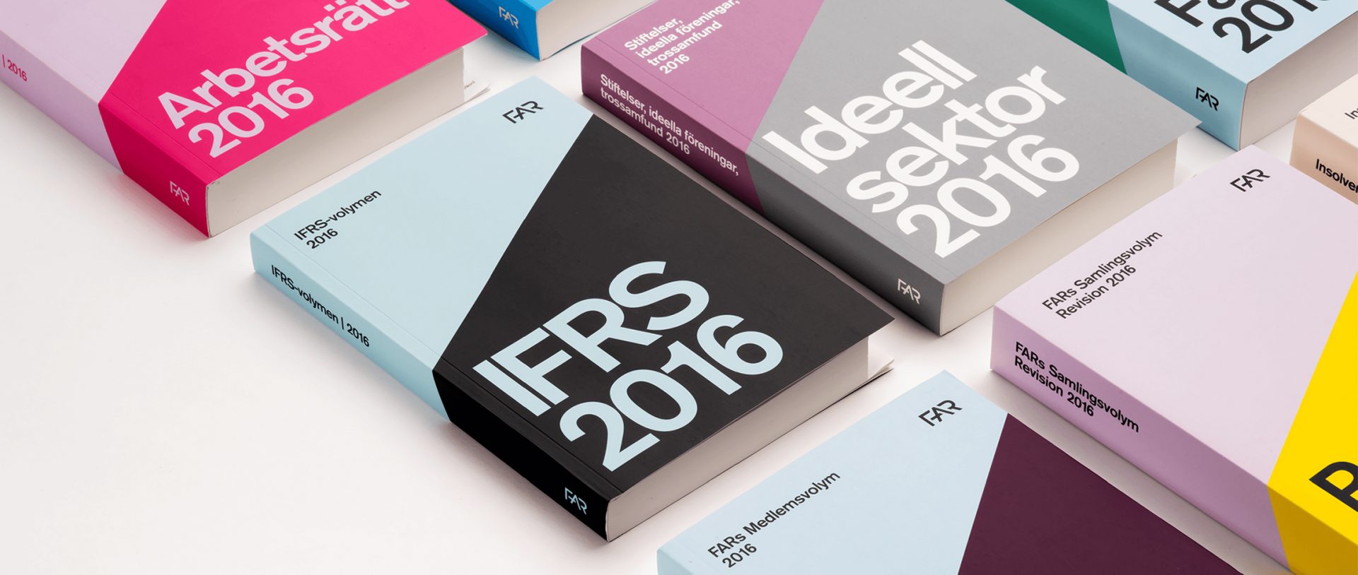
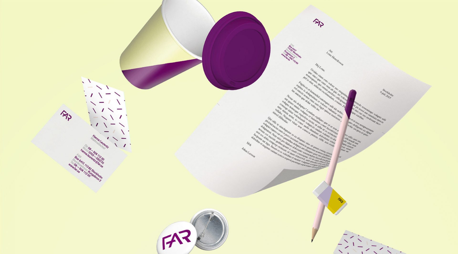
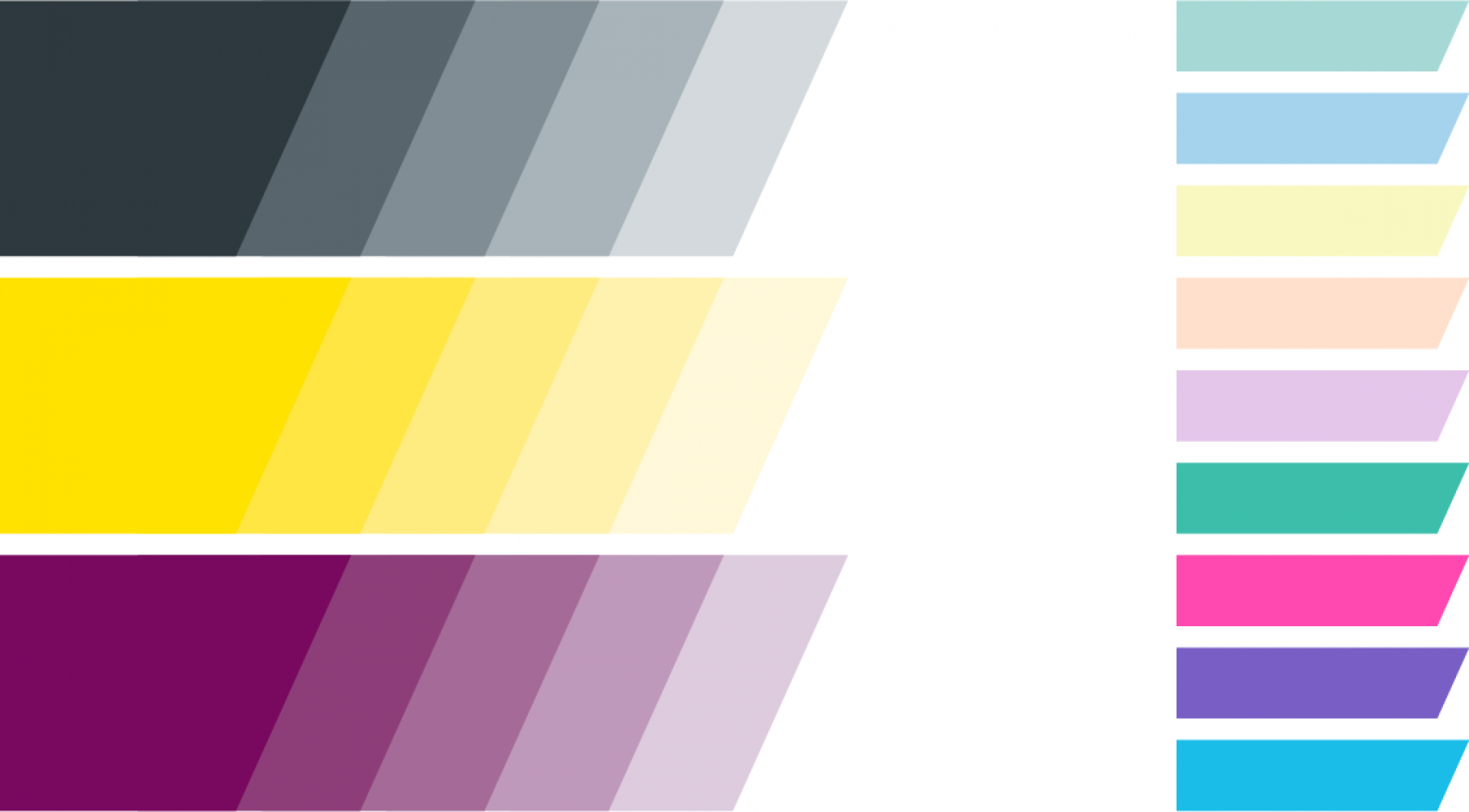
The color palette includes three primary colors, nine supporting colors and one ambition – endless combinations.
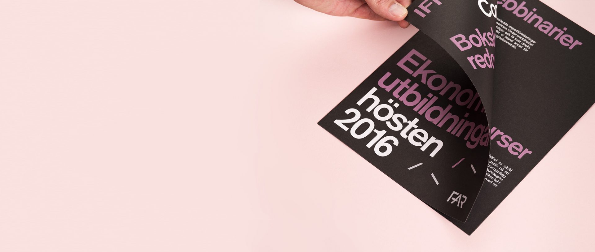
Berthold Akzidens Grotesk Medium is our primary typeface. And by allowing for a creative and flexible usage of the typeface, a simple and straight forward font is turned into a recognisable brand element.

The visual identity provides endless opportunities to be creative. A stringent usage of the brand elements enables us to create recognition though monotone.
Lena Henriksson
Head of Communication, FAR
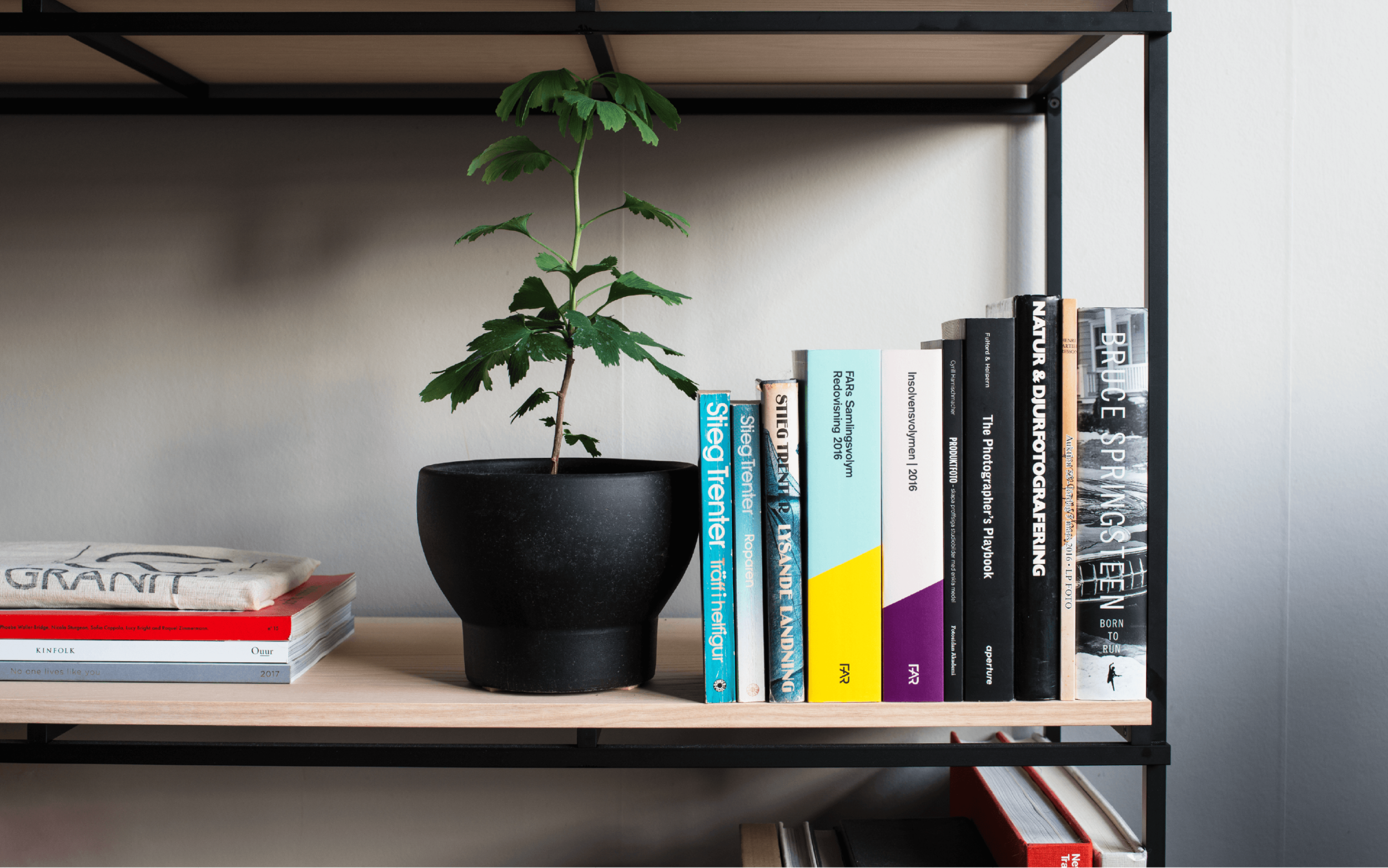
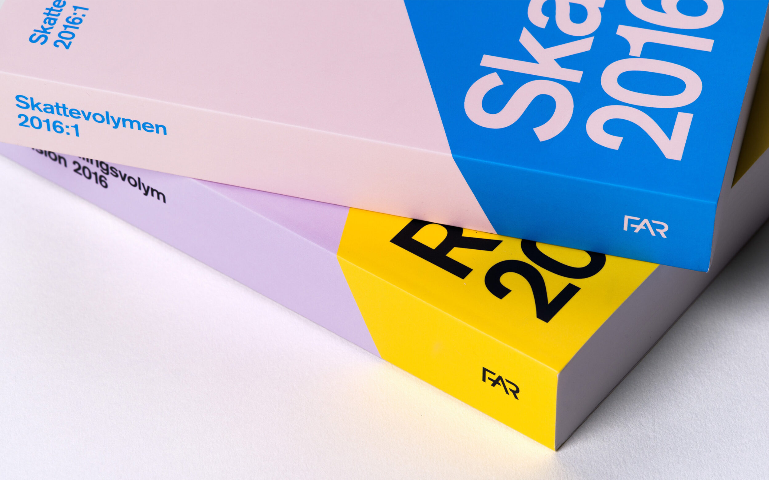
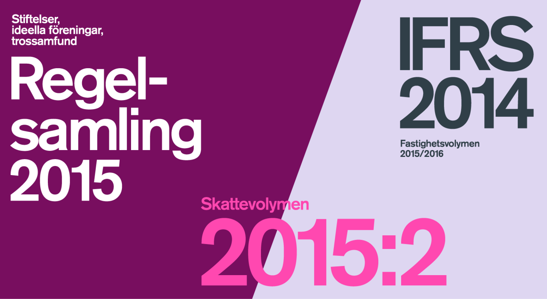
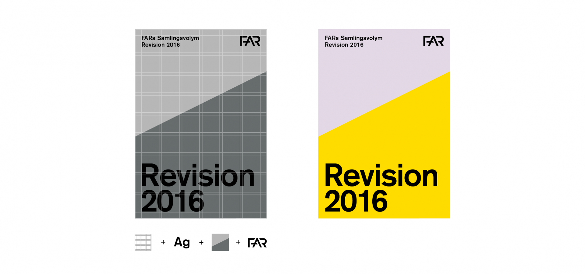
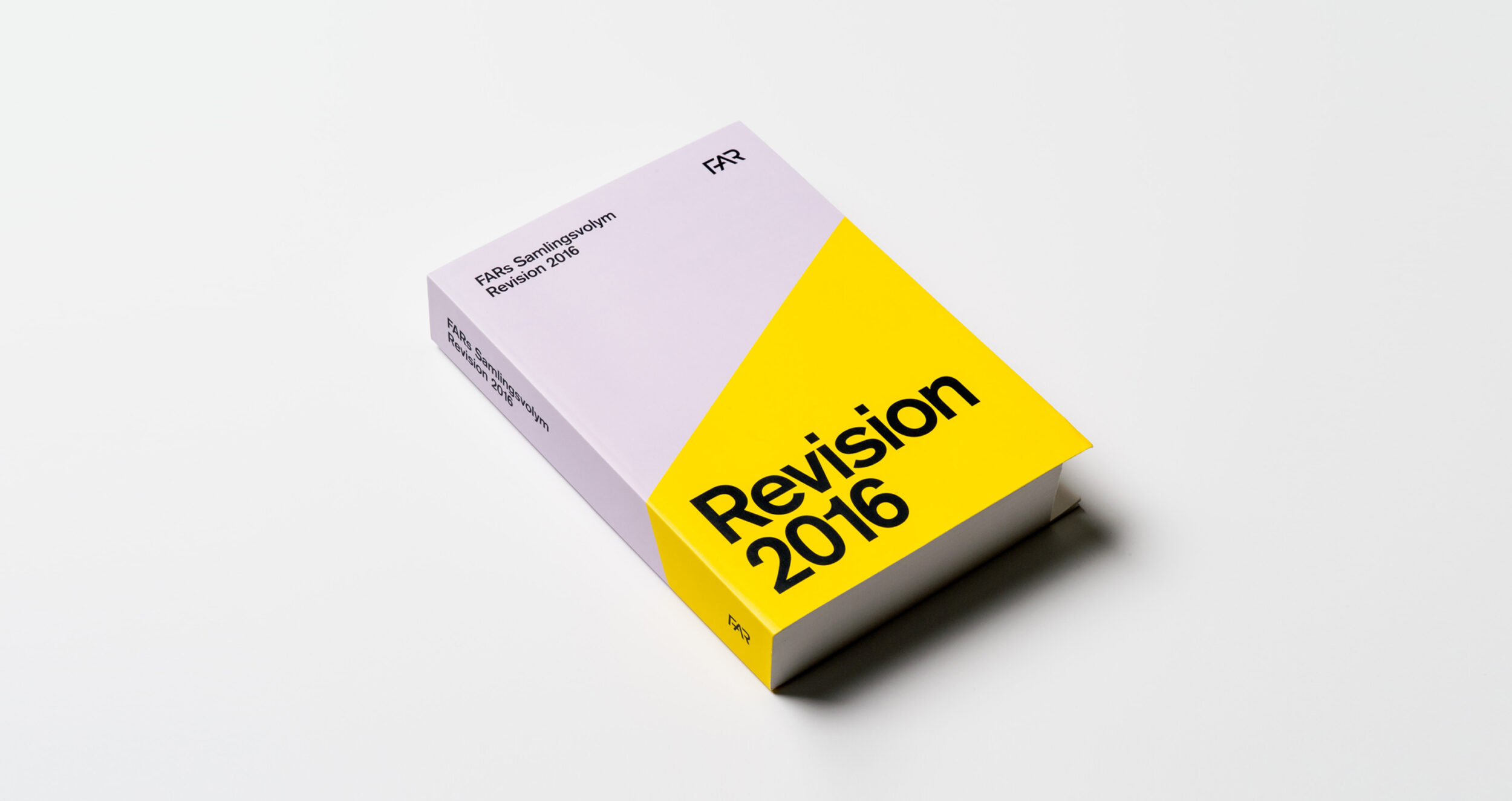
Our book covers and brochures highlight flexibility by utilising the graphical format, pattern and broad color palette to provide a dynamic appearance without loosing any brand consistency.