Studio Aisslinger
HolmquistSign
Digaloo
Unique Cosmetics Sweden
In 2014 Nordic Choice Hotels acquired Swedbank’s former headquarters on Stockholm’s Brunkebergstorg. In collaboration with award-winning architecture firm Studio Aisslinger, Hobo opened its doors in March 2017 – Stockholm’s first truly hometown-inspired lifestyle hotel.
With over 150 hotels within an area of 186 square kilometers, the city of Stockholm has no shortage of living options for travelers. How will Hobo set itself apart within this saturated landscape?
Of Stockholm’s 150+ hotels, not one meaningfully connects today’s creative-minded travelers to the dynamic life and trends that the city is known for. Most hotels attempt to appeal to travelers by unnaturally emulating other city hotels like those of New York and London. The true Stockholmer’s hotel is long overdue.
Not having to look far, we sought inspiration right from our backyard. Identity Works worked alongside Studio Aisslinger to create a hotel brand experience that digs out and celebrates beloved spots, music, design and other things of local interest. The result is a unique and homegrown community that unlocks Stockholm to the curious visitor.
In 2014 Nordic Choice Hotels acquired Swedbank’s former headquarters on Stockholm’s Brunkebergstorg. In collaboration with award-winning architecture firm Studio Aisslinger, Hobo opened its doors in March 2017 – Stockholm’s first truly hometown-inspired lifestyle...
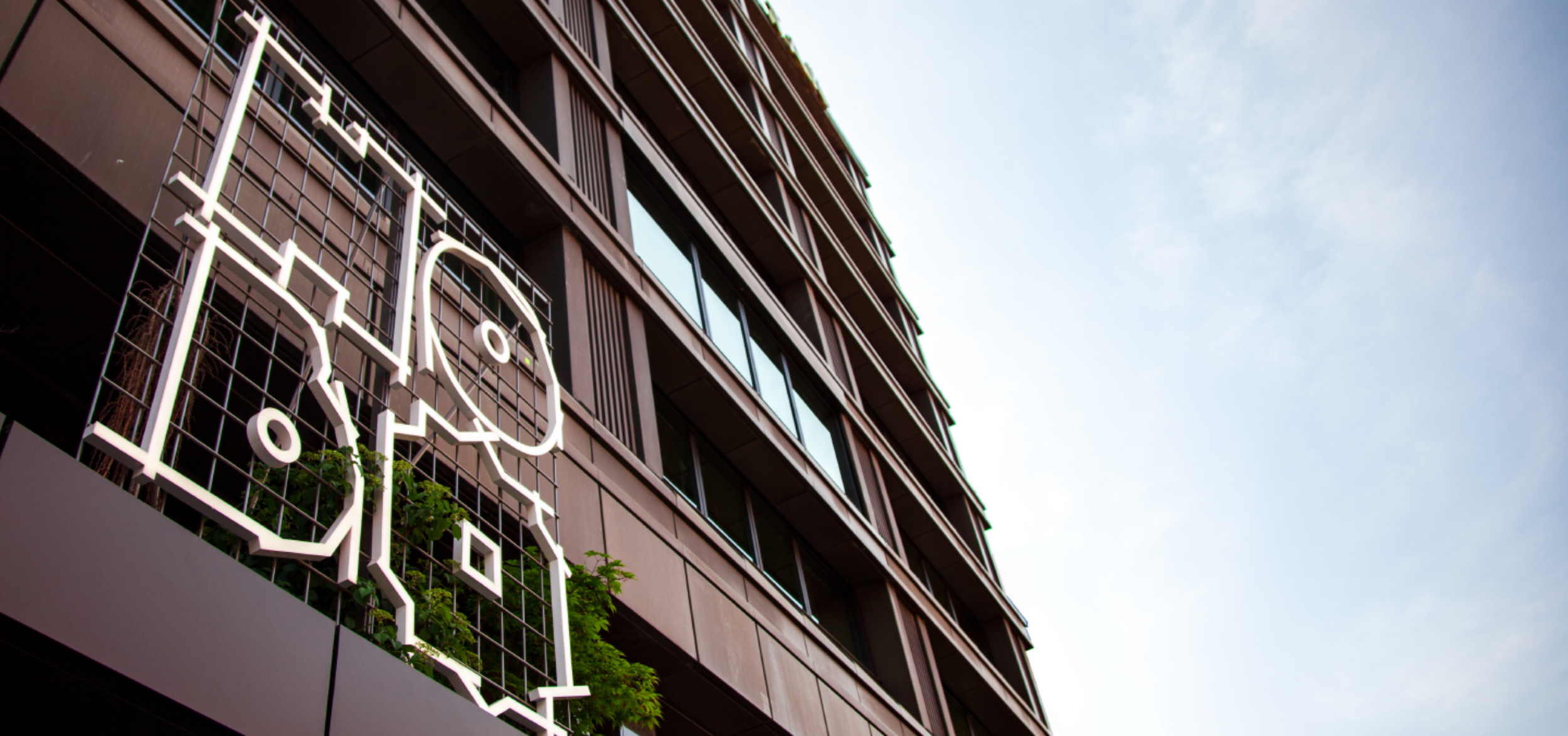
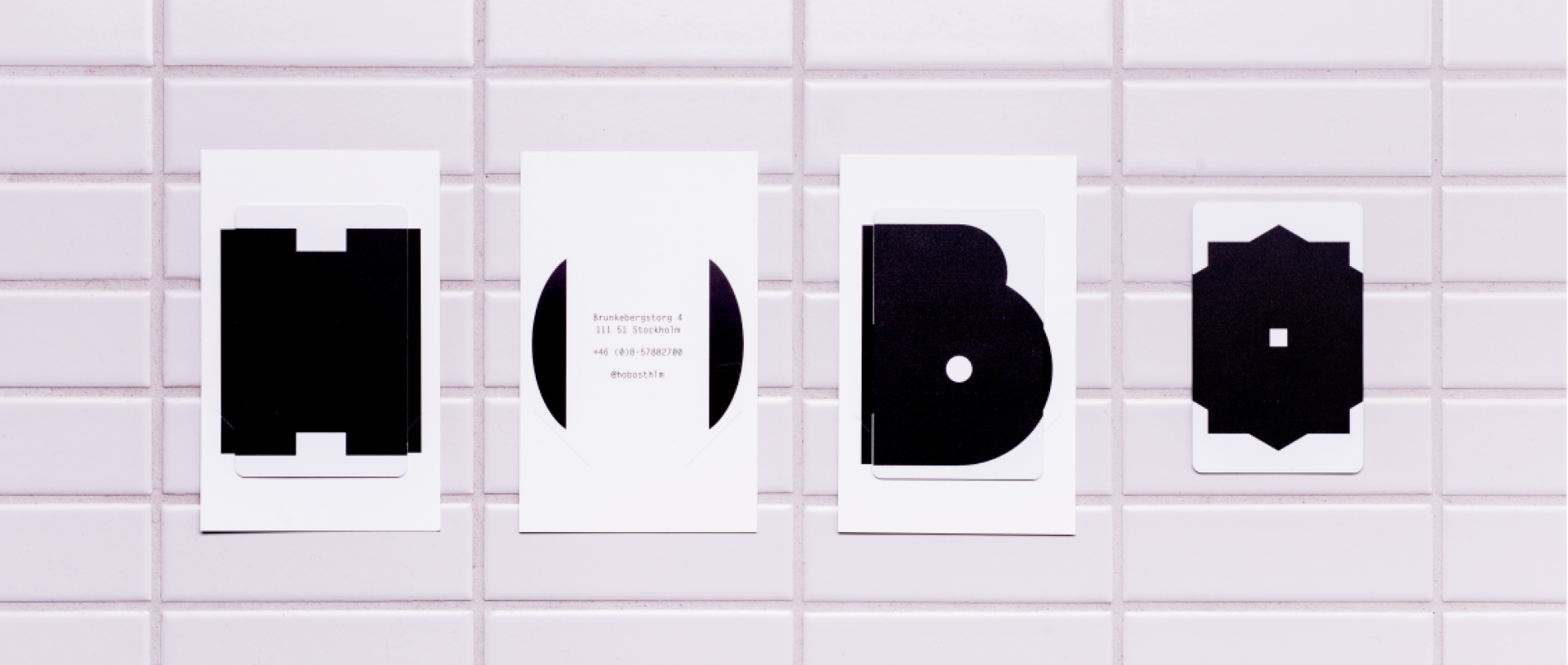
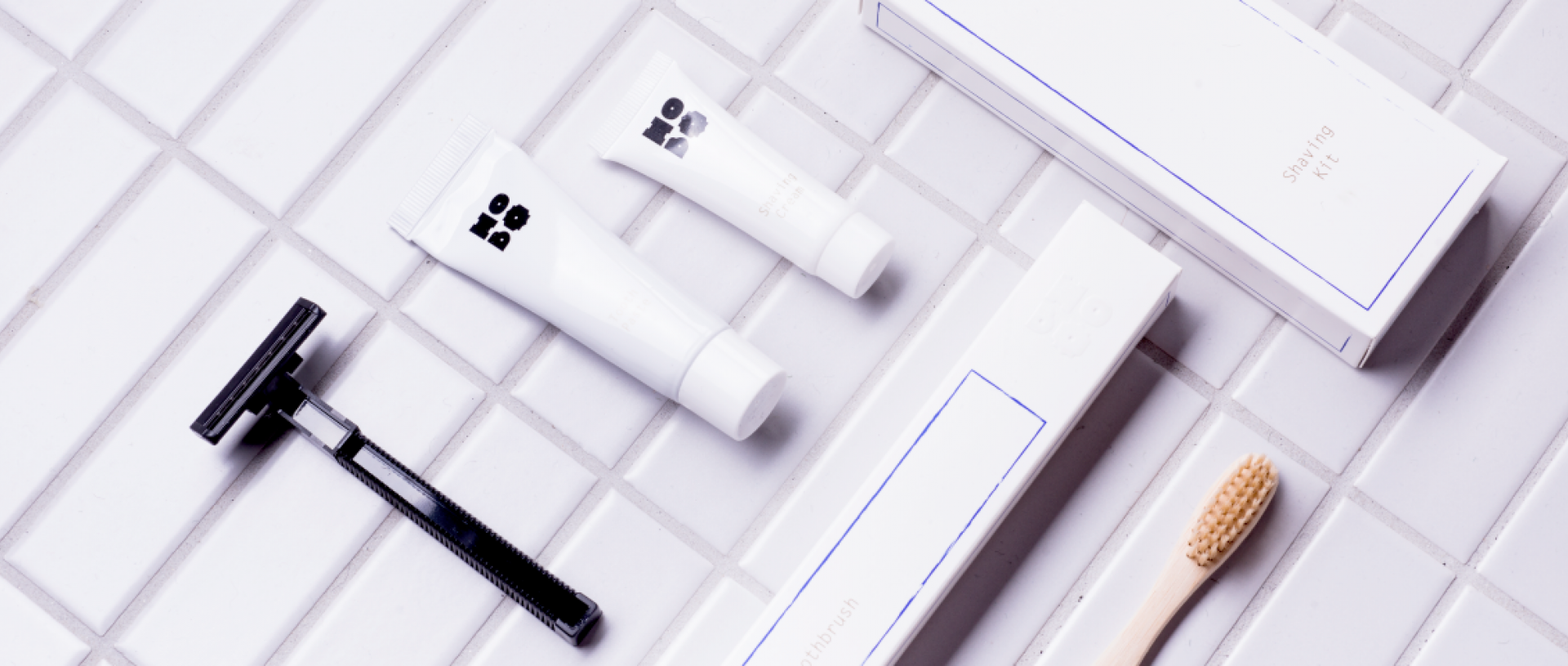
Hobo’s boldest brand representation – The black primary logo. Secondary logos are used as a graphic element
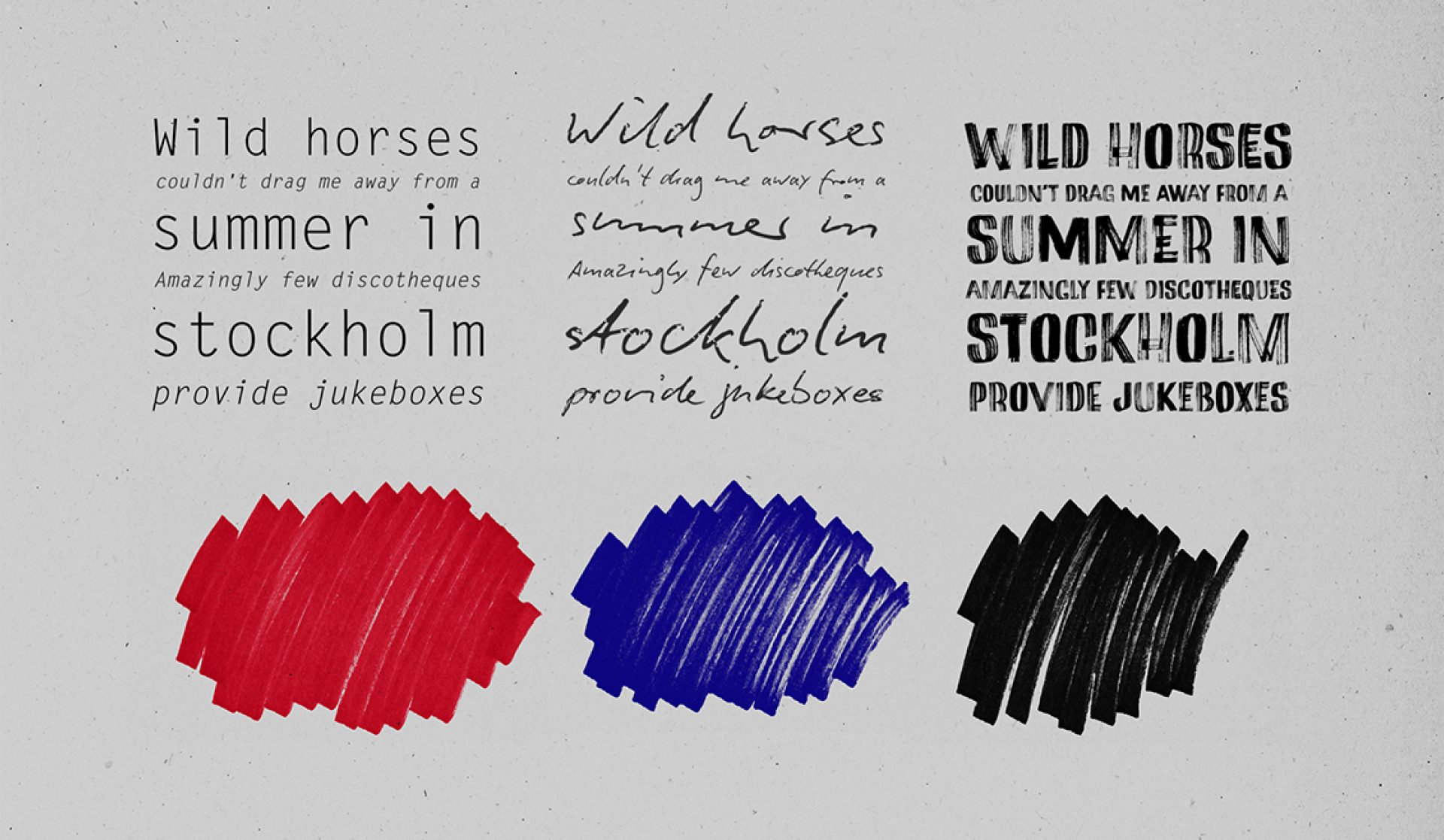
The Hobo typography has a functional san serif that is complemented by two more personal typografis that has taken its inspiration from the characteristics from the marker and the ball-point pen. To strengthen the character of the ball-point pen this is set in dark blue and for the marker we use a clear read color
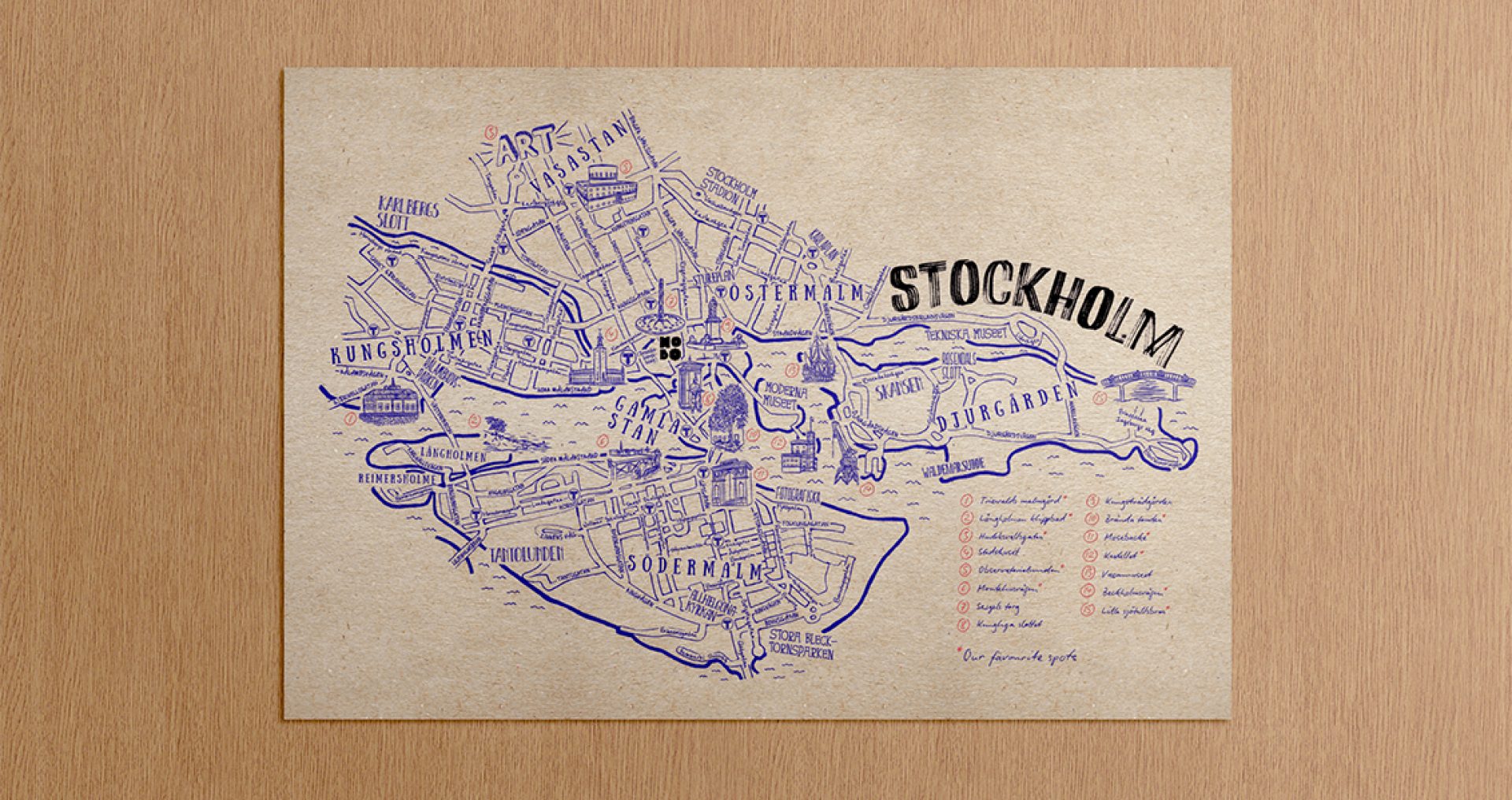
In our illustrations we pick up the ball-point character from the typography. In example we in the illustrated Stockholm map share our personal tips with little scribbled notes.
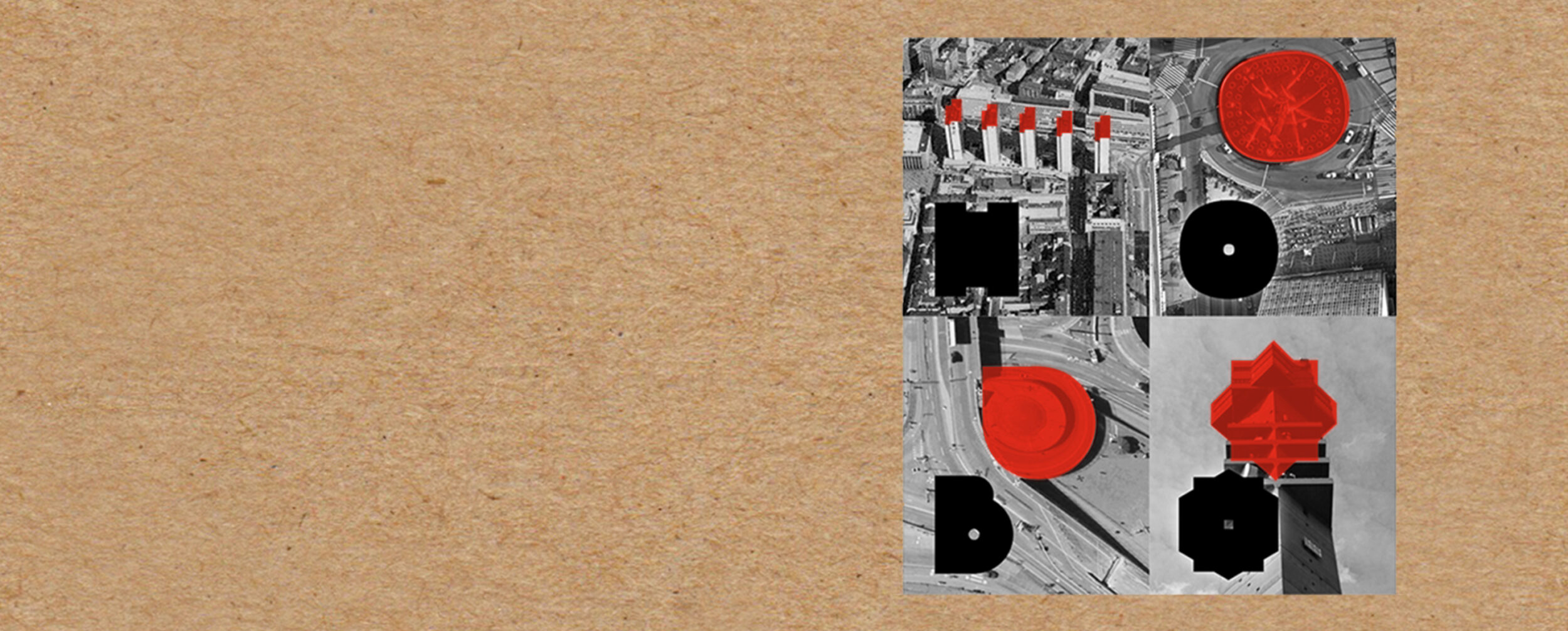
Like the logo, the Hobo pattern also borrows from a beloved Stockholm structure - Sergelfontänen. Names of favourite local spots are also sprinkled throughout the pattern
Jenny Edh Jansen
Director of Marketing & PR