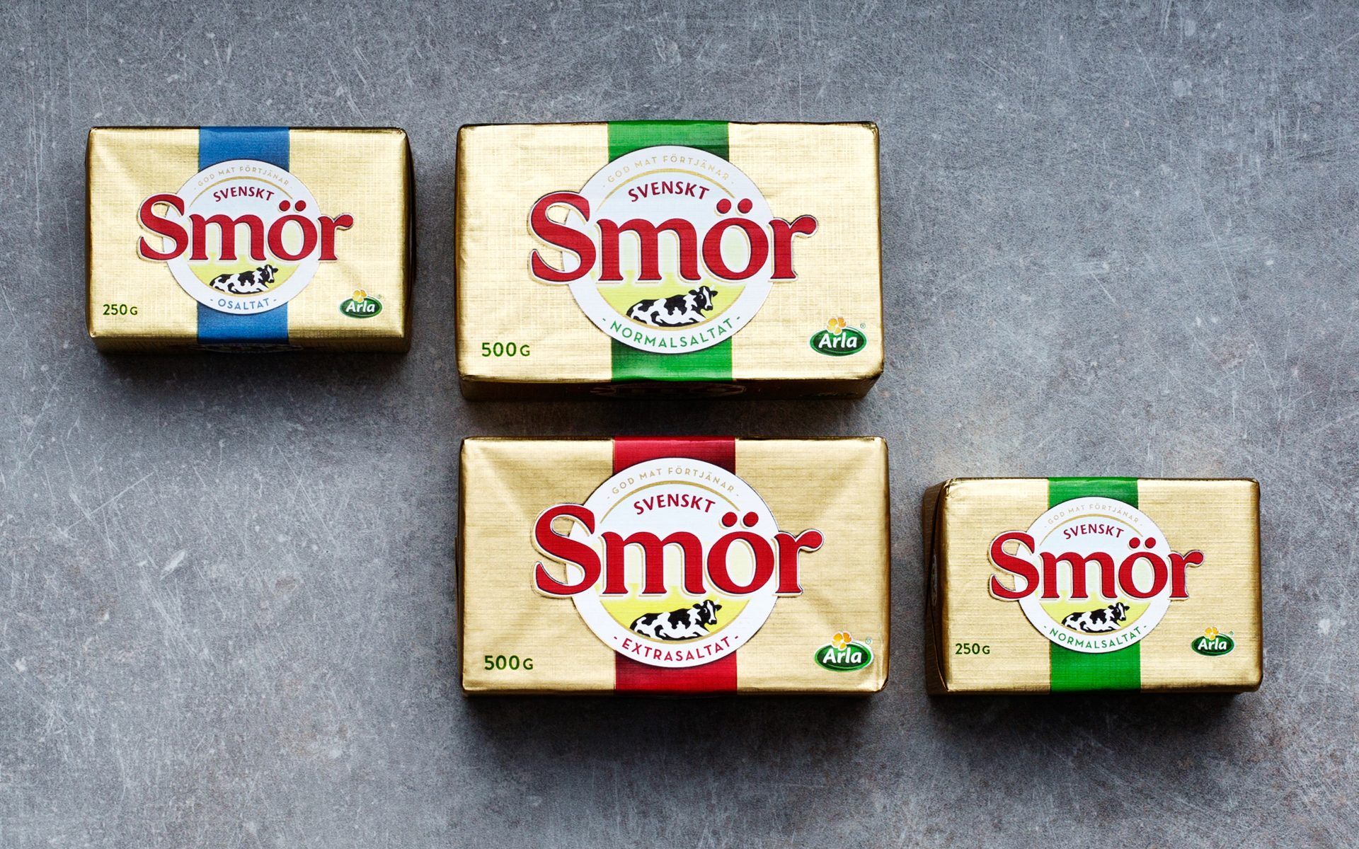
Svensk Smör. Sweden’s premium butter brand. And one with no real competition when it comes to quality, taste and local origin. But positions rarely remain unchallenged and with the emergence of local producers, new premium brands and private label artisan butter initiatives, Svensk Smör found need to reaffirm it’s position as the absolute market leader.
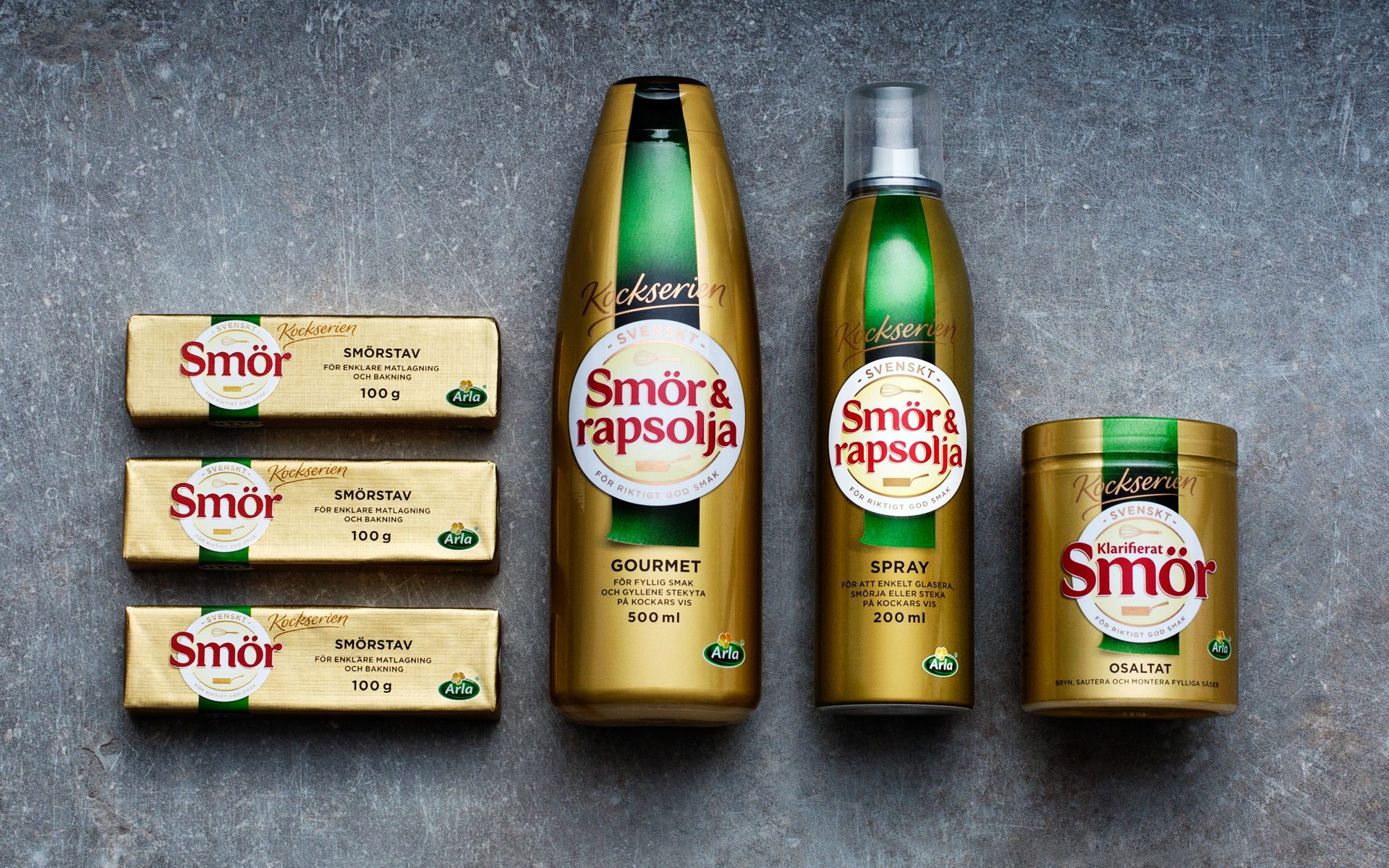
Simple. Make a clear statement to emerging competitors: Svenskt Smör is ‘THE’ Swedish butter - hence the name. And to support its brand position, as the number 1, introduce a new line of specialist cooking butters - Kockserien.
Consumer research told us two things. Number 1 - consumers want to buy local Swedish butter. More Swedish equals more premium. Makes sense. Number 2 -consumers like the existing design very much, almost too much, demanding it be kept.
Thinking
The design in a word: subtle. The details. Crafting of typography, illustrations, hierarchy and even the gold. Something lighter and more modern. A new noticeably unnoticeable design expression. One capable of incorporating the new Kockserien line - part of the family but with a professional edge. Clean, clear, bold Svenskt Smör. Change without change successfully achieved.
Svensk Smör. Sweden’s premium butter brand. And one with no real competition when it comes to quality, taste and local origin. But positions rarely remain unchallenged and with the emergence of local producers, new premium brands and private label artisan butter initiatives, Svensk Smör found...