Since the launch in 1992 the Friends Foundation has been the leading voice to shed light on one of society’s most terrifying problems: bullying. Over the years Friends has followed many larger non-profits who increasingly compete for attention by depicting one reality more painful than the other. What if there was another way for Friends to raise their voice?
As we embarked on a brand journey together with Friends in 2018 one key question emerged: Is there a way to inject more hope and optimism in our brand communication and still break through the noice?
The new Friends is like a beam of hope, bright, colorful, creative, sometimes serious, mostly confident but always friendly and hopeful sharing their expertise and showing the world that we in fact can end bullying — if we work together.
Since the launch in 1992 the Friends Foundation has been the leading voice to shed light on one of society’s most terrifying problems: bullying. Over the years Friends has followed many larger non-profits who increasingly compete for attention by depicting one reality more painful than the...
Friends celebrate diversity and break norms. Everyone’s different, and we know different is fantastic.
This is what we want the polychrome logotype to convey.
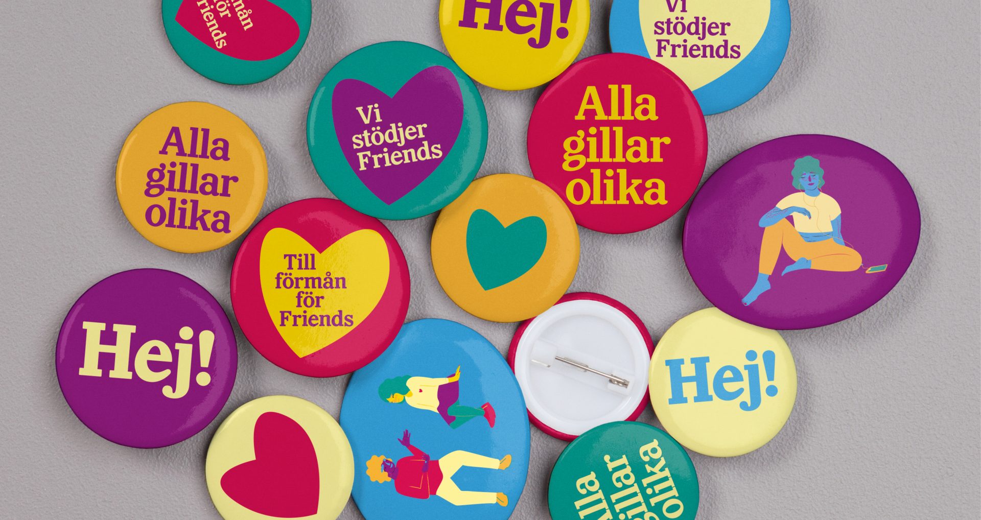
The logotype is available in each color of the palette, and any primary color can be placed on any secondary color, or the other way around. As the logotype is responsive, the heart can be used as a stand alone brand asset or combined with text or illustrations.
Yellow is Friends’ primary color, and comes in three shades.
It is complimented by four secondary colors, but a yellow presence is always retained.

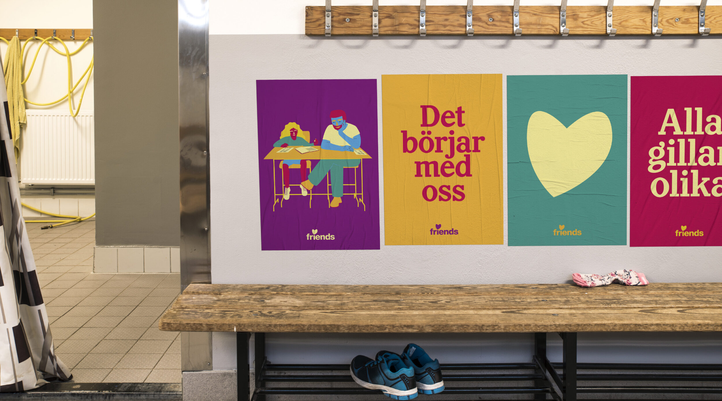
We created a stock of bespoke illustrations and background images,
that can be used separately or combined, to create a variety of different scenes.

Simple shapes and combinations of primary and secondary colors create a strong brand connection and elated expression.
Friends Capitaine is an energetic and charming, chunky slab serif with unique details and peculiarities. Drawn by Göran Söderström of Letter From Sweden, it too represents the idiosyncratic characteristics of different individualities. “Capitaine is like a grown-up who doesn’t try too hard to look cool nor perfect, and that is perfectly fine.”
Lovisa Lönnebo
Kommunikationschef
Friends employees can mix-and-match stationery, with different color combinations for each individual part, adherent to the idea that everyone is different.

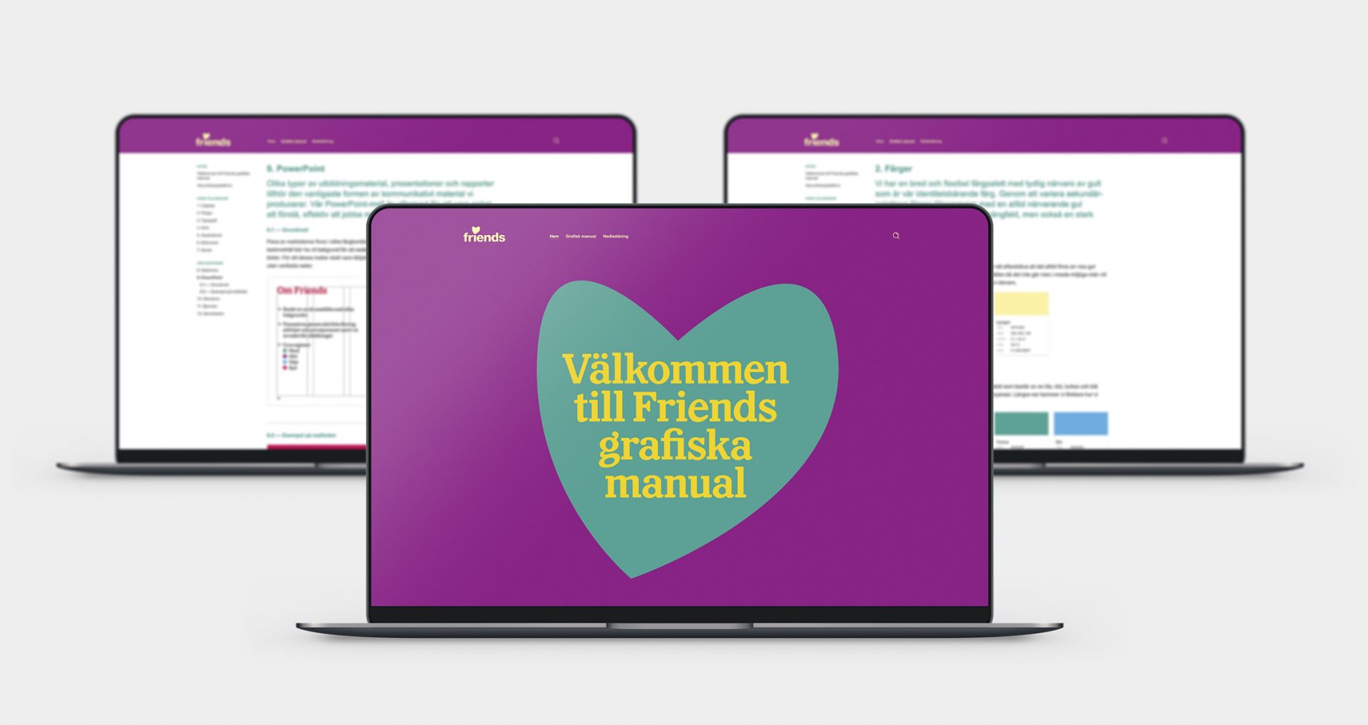
Using a brand management software enables Friends to keep their identity and guidelines constantly updated, and give them access to all toolbox assets.