Kronans Apotek is the modern, down-to-earth and empathic pharmacy. Always caring and understanding, providing advice to customers in all walks of life. For Kronans Apotek we have created a warm, yet functional world that truly stands out amongst the sterile competitors on the market.

Illustrations
The illustrations are effortless and simple. A bold use of the brand colour palette ensures the illustrations are both pedagogical and welcoming. Matter of fact and warm. The abundance of illustrations also come in animated versions, widely extending usage and strengthening the storytelling.

Typography
The main typeface is Filson Pro, a clear, legible yet friendly geometric sans serif with rounded details and quirks. It builds recognisability with its distinct form and unifies the brand.
Progress Two is used as a complementary font for all figures and numbers, to highlight offers and special deals.
Images
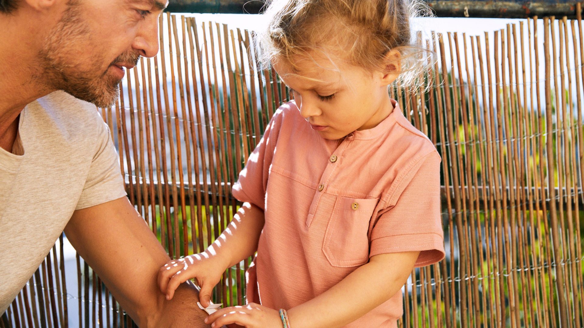
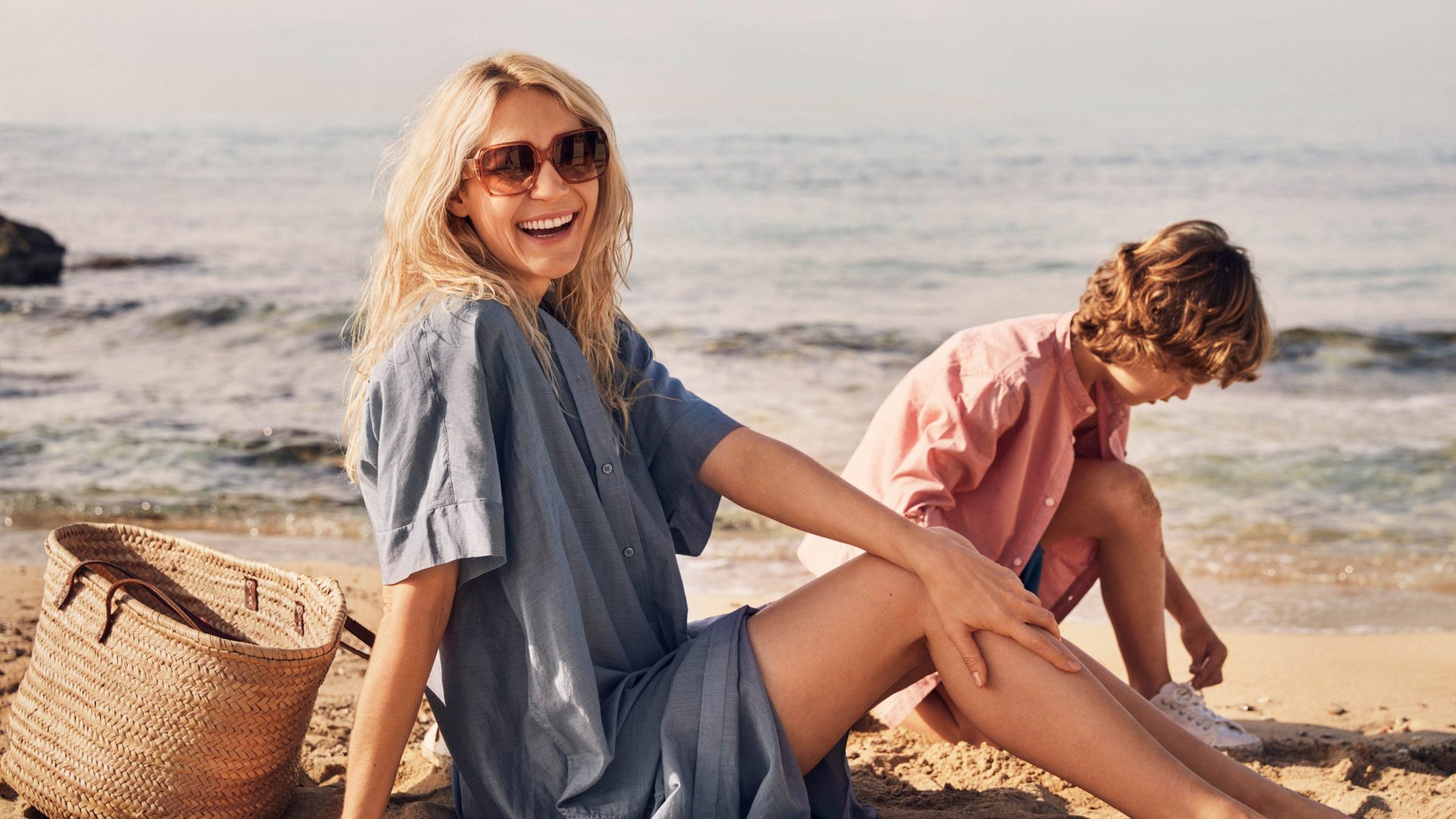
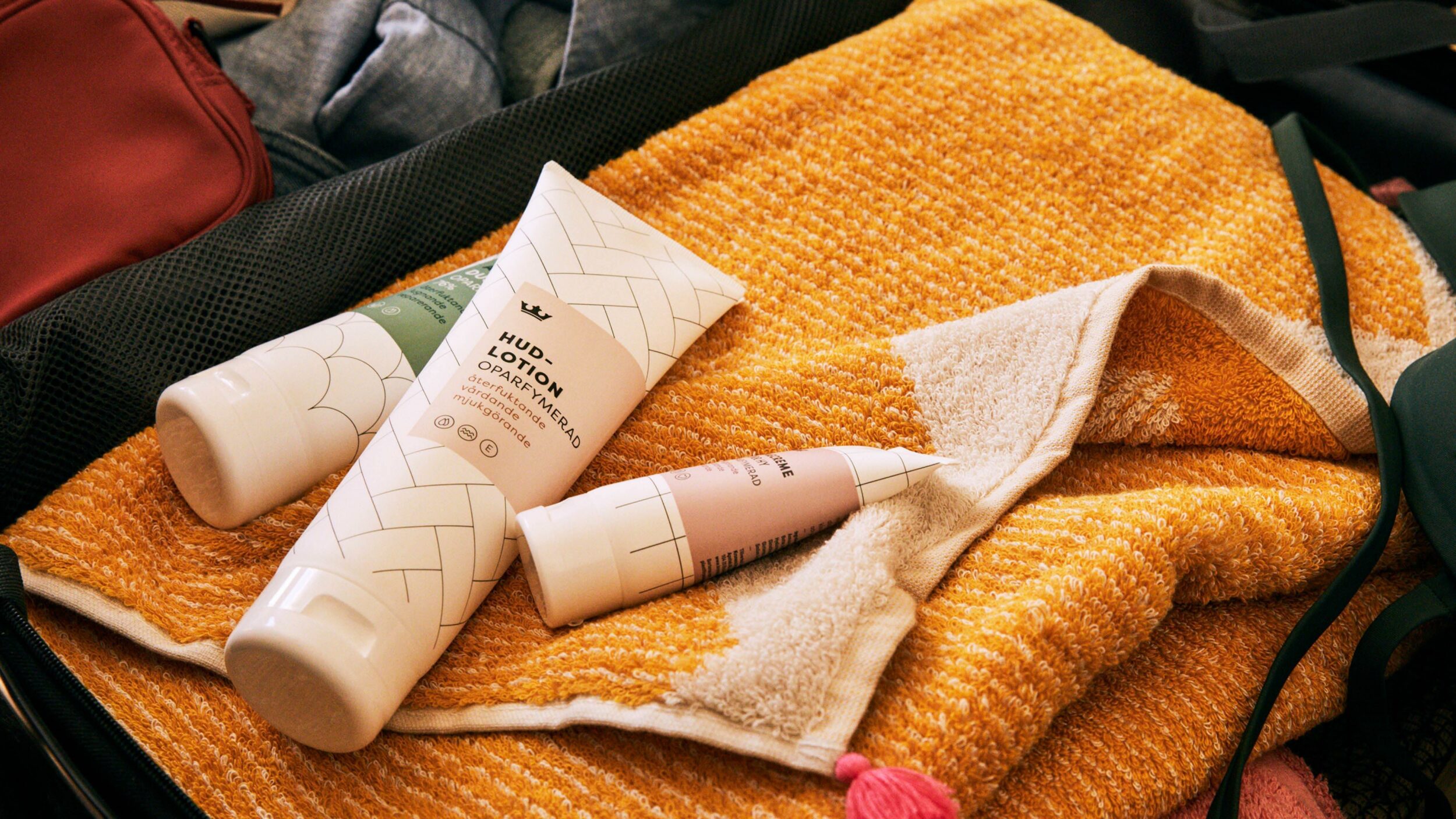
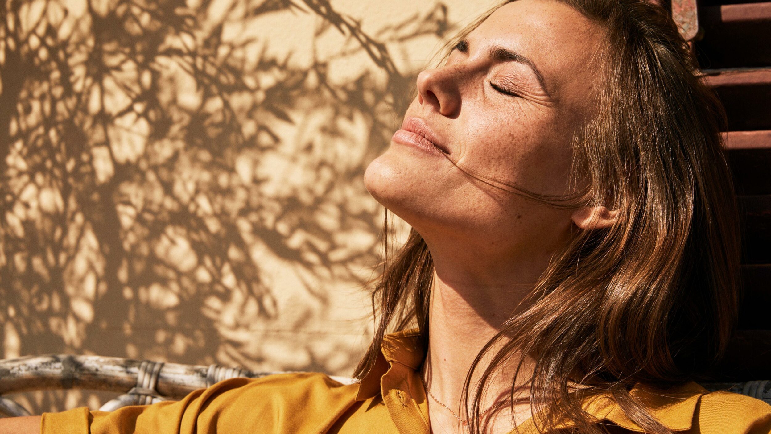
We portray authentic people in real moments. Capturing everyday joys and occasions in life, explored with family and friends. The overall warmth and colour scheme is carried through to create a unified experience of the Kronans Apotek world. Products are consistently presented in an ordered and clear manner. Products are placed at an angle, always with visible shadows on a coloured background.