Sifo Kantar
Maverick
When minPension gave us this assignment they were clear on the importance of recognition when visitors interact in different channels, i.e. their online bank office or pension company. They wanted the visitor to understand that all information comes from a nonpartisan source, no matter where they see it, which means distinct differences in whatever channel minPension is present. They had also conducted investigations of their own and shown that a lot of people view pensions as dull and difficult to understand.
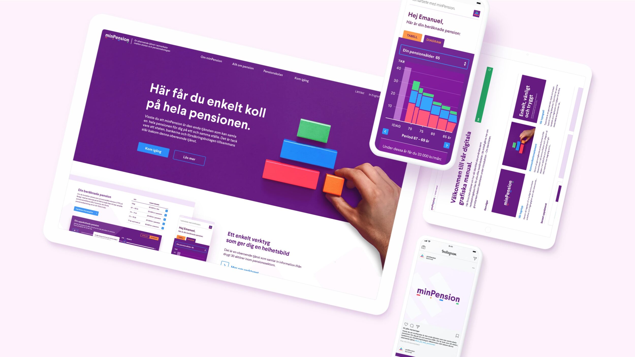
Our work aimed to counter this by being easy and exciting. One of our mantras during the process was to “lower thresholds”. That’s why we based our design on the simplicity of wooden building blocks where every topic is pedagogically explained by human presence.
To increase the distinctiveness minPension needed to leave the blue/white colour world that some of the companies behind the service already use. A multi-coloured logotype became a part of the solution. A darker background colour became another wat to differentiate minPension and also worked as a visual aid for the viewer. Darker interfaces draw the eye to illuminated elements, and it’s also better for our eyes and the environment, since dark areas on screens need less power.
This was an exciting project with a myriad of banks and pension companies involved. Now we’re just hoping all inhabitants in our beloved Sweden gets a little bit more excited about their pensions.
When minPension gave us this assignment they were clear on the importance of recognition when visitors interact in different channels, i.e. their online bank office or pension company. They wanted the visitor to understand that all information comes from a...

The name ”Min Pension” is used by many others. To differentiate we put the two words together and capitalizedthe ”P” since the focus of the service is pension.


